Topics

Superfamilies

by PROF. HANS R. HEITMANN

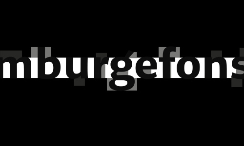
____ Our superfamilies Legit, Arccus and Komplex feature several weights and styles, yet they all follow an unique uniwidth system: Within each superfamily, all identical glyphs share the same width. In this article we will talk about the background and advantages of such a type system.

→ read more

Better Justification for the Web

by JOHANNES AMMON

____ In the third part of our justification series I pitch several ideas on how justified text on the web could be improved. I will also present some unorthodox approaches that may lead to further improvements in the future and will eventually offer a sneak peek on how better justification on the web could look like.

→ read more

Justification on the Web

by JOHANNES AMMON

____ How does digital justification work? And why does justified text on the web usually look horrible? Part two of our series on justification talks about the problems and opportunities of justification in terms of digital typesetting. How come high-quality justification on the web is still a problem in 2020?

→ read more

Gutenberg’s Justification

by JOHANNES AMMON

____ Justified text often looks terrible. What is good justification and how can we reach it? This is part one of our three part series about justification. It focuses on Johannes Gutenberg and his use of justification, which has been called masterful. How come today with advanced technology, justified text often lacks quality and professionalism?

→ read more

Alien Planet, Alien Alphabet

by JAN BAROW

____ A fictional alphabet for a narrative PC adventure game. The script is used (and the game is set) in a futuristic metropolis on the edge of a gigantic crater veiled in constant fog. Strange and unfamiliar, but by no means inaccessible: This impression of the setting should be taken up and reinforced by the script.

→ read more

Abstract calligraphy

by KORBINIAN NIEẞNER

____ One of our major subjects is the so called »abstract calligraphy«, or »free calligraphy«, or »gestural calligraphy«. This special form of calligraphic expression differs from formal calligraphy, whose main focus is the creation of readable characters.

→ read more

Letter spacing

by PROF. HANS R. HEITMANN

____ The spaces between the letters of a typeface have a significant impact on its legibility. They can affect or even destroy the aesthetic shape of the word. I propose that there is — especially in lower case — a correct amount of letter-spacing, with little variability.

→ read more

Capital Sharp S (ẞ)

OPINION PIECE BY PROF. HANS R. HEITMANN

____ Since this additional glyph has been officially added to German orthography in 2017, typedesigners worldwide might ask themselves: How should a capital sharp S look like?

→ read more