Superfamilies
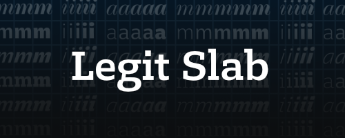
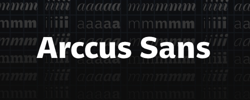
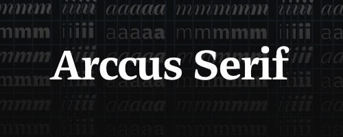
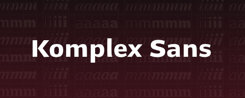
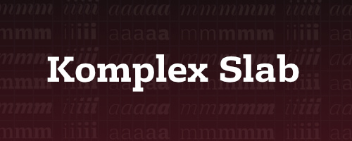
Superfamilies are type families that consist of a variety of several styles of typefaces. Arccus and Komplex are superfamilies that unite the four different styles Serif, Sans Serif, Slabserif and Didone with different weights and corresponding italics.
This is new: Our superfamilies come with a consistent uniwidth-system. Within a superfamily, every glyph takes up the same amount of space, across all styles (Sans, Serif, Slab, Didone), including all the different weights and italics. The Arccus superfamily comes with 44 fonts, Komplex brings 54.
The weight and style of any glyph within a superfamily is exchangable – without affecting the layout at all. Lines of text remain completely static when changing the font, and with this comes incredible flexibility: last-minute changes in editorial design, advanced animation or innovative hover effects on the web – our superfamilies have got you covered.
What’s special about our superfamilies? First of all there is no dip in quality compared to a standalone typeface, as you might expect. We did not squish or skew our lettershapes in order to force them into an existing uniwidth system. Instead, we developed the different glyph-widths from historical and practical perspectives and defined our own grid according to our very particular → philosophy on letter spacing, resulting in a system that does justice to all styles.
Benefits of the uniwidth system
- for web animations, or for hover effects on links, the consistent width is indespensable and invaluable.
- during the creative process, all 54 styles can be viewed and compared within the same space.
- in a final layout – say, a book with 500 linked pages – you can add emphasis at the last minute and change the style of passages or even the entire copy text without affecting the layout. There is no change in line breaking, everything stays right where it belongs.
Our two superfamilies in comparison
The Komplex superfamily is more neutral, firm and reserved. Its lettershapes could be described as »slightly extended«. In contrast the Arccus superfamily seems softer with its distinctly humanist shapes and runs a little bit more narrow in general. The Legit superfamily is a more narrow, user friendly and highly functional application of our Komplex system.
What exactly does »uniwidth« mean?
Uniwidth does not mean monospaced. In a monospaced typeface all letters share the exact same width, or to put it differently: Every glyph stays inside a fixed with box of the same width (which is historically rooted in technical limitations of early typewriters).
The uniwidth system of our superfamilies is different: every letter has its own individual space. This space stays the same for that specific letter throughout all the weights and styles.
Superfamilies created by others vs. superfamilies made by Finaltype
What makes the superfamilies made by Finaltype special? There are already typefaces with uniwidth compatibility throughout weights. What’s new is the integration of various styles (Sans, Serif, Didone und Slab) while maintaining a high quality standard (no squishing and skewing). Stylistic diversity, in combination with the total swapability of letters within our superfamilies, is our distinguishing feature.


