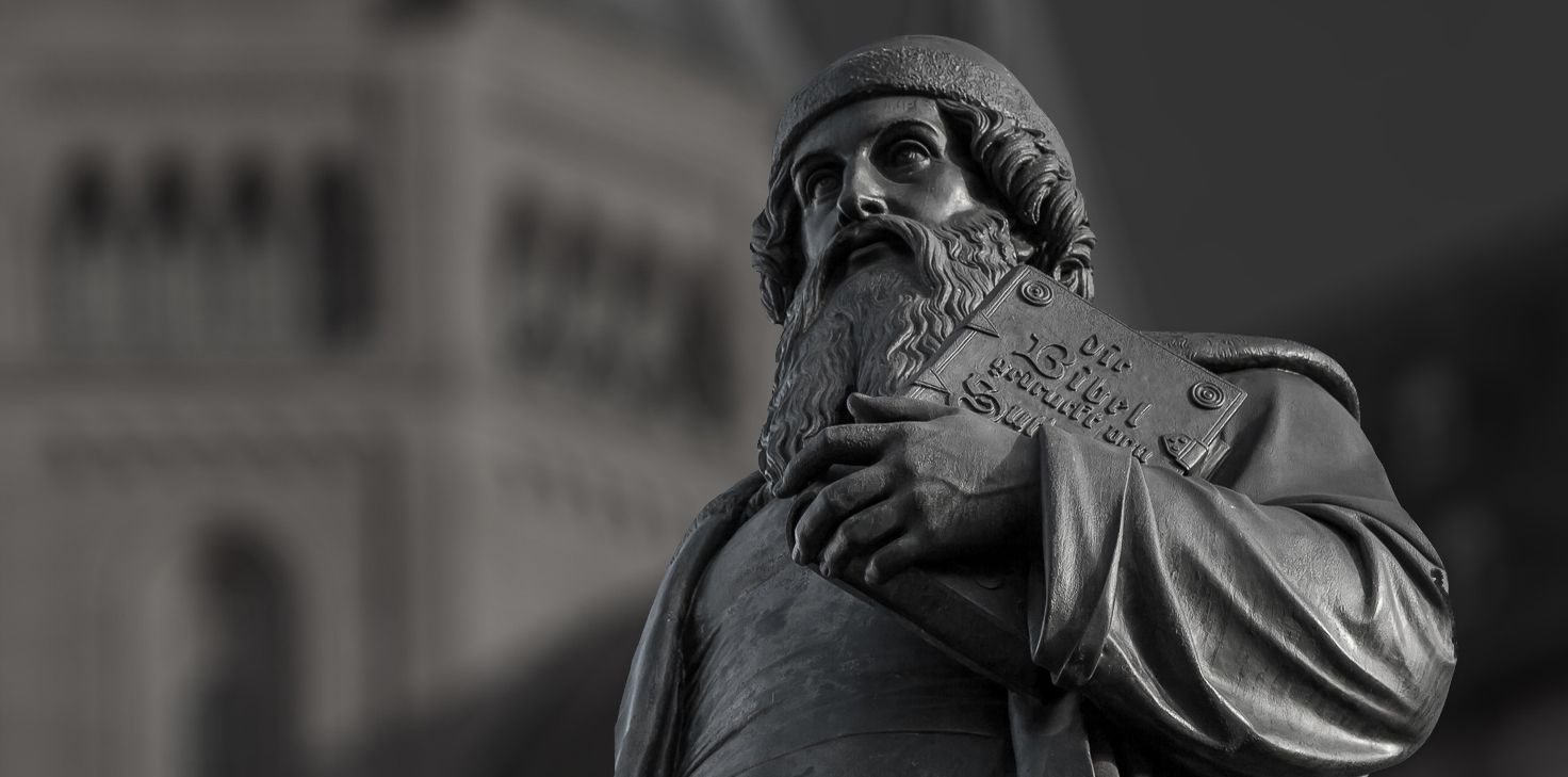
Gutenberg’s Justification
The desire to design the right edge of a text as evenly as possible is ancient. [1] Throughout history one can see attempts to even text out, so that the right edge of the text is justified – be it in handwriting in the Middle Ages or even Ancient Rome, for example at the Trajan’s Column. However, it was the invention of the letterpress with moveable type by Johannes Gutenberg that created the technical requirements to efficiently make use of justified text. [2] Before letterpress, handwriting was the most common method to produce and reproduce text and it was difficult to reach the quality of justification that we have today in print. Nailing down the exact length of a line required a lot of foresight while writing, which in turn requires tremendous experience and skill. The invention of manual typesetting made it suddenly possible (and a technical requirement) to plan line breaks and to fill all the space inside of the column using different methods, such as abbreviations and a lot of spacing material.
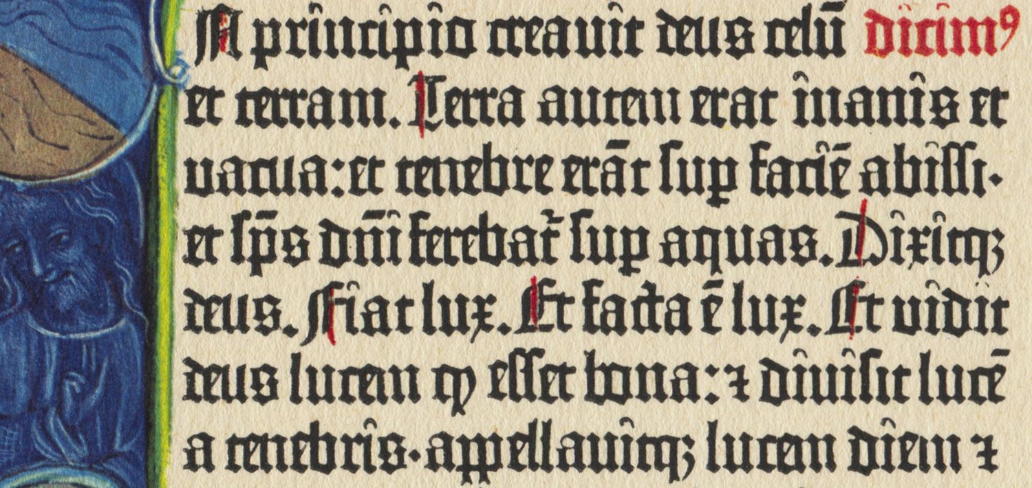
The even justification in the 42-line Gutenberg-Bible is the gold standard for many designers in terms of quality. Johannes Gutenberg had to ensure a certain quality in order to garner acceptance for his new technology from an audience used to high-grade handwriting. [3]
What makes good justification?
Justification is often executed poorly these days – Gutenberg’s justified text is in contrast often referred to as masterful, until today. So what is good justification and which parameters can help accomplish this today?
The most common problem with today’s automated justification is often the too wide space between words. With high-grade justified text, the space between words hardly differs from the regular space character. The space between words should also not be larger than the line spacing, as this would create visually unattractive vertical holes [4] and make the eyes shift in lines while reading.
Today, most common word processing software, such as Microsoft Word or Apple Pages, naturally offer a button to justify text. It is not easy, however, to accomplish high-quality justification with this software. With professional software (such as Adobe InDesign) the quality of justification can be increased through a range of typographic parameters – some of these adjustments can also be made in Word or Pages.
In general, the interaction of the following aspects influence the quality of justification [5]:
- column width
- font size
- word spacing
- line height
- letter spacing
- kerning
- availability of hyphenation
- optical margin alignment
The adjustment of these parameters influence each other and as a result define the word spacing. In combination with adverse line spacing this leads to the previously mentioned undesired rivers.
Gutenberg’s Justification
In his 42-line bible (B42) Johannes Gutenberg managed to produce an even typeset that had »[…] no previous example and therefore made this first letterpress book a typographic masterpiece, which exceeded simultaneously invented letterpress […] by far.« [6]
How did Gutenberg accomplish this? He and his co-workers made use of a wide array of individual parameters that in sum created a balanced typeset.
Abbreviations
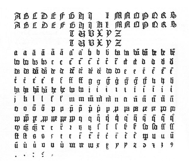
As it was common during this time, Gutenberg made use of a lot of Latin abbreviations in his bible. As we can see, the use of abbreviations was much more frequent than it is in today’s German or English texts. Some abbreviations consisted of only one letter, but at the same time could have different meanings depending on the context they were used in. In addition, Gutenberg’s B42 varied abbreviations and their exact application depended on the compositor who was assigned with the current segment of the bible.
Ligatures
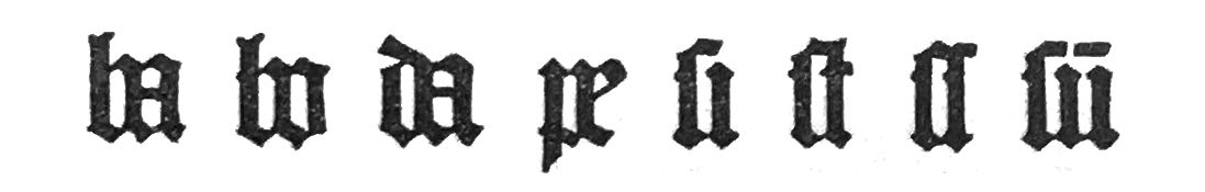
Another important tool to retain flexibility in filling the lines were ligatures, the combination of two letters in a single glyph. Ligatures originate in the tradition of handwriting, where sometimes even the most unusual letter-pairs formed a connection – be it to save space, or as part of the writer’s artistic freedom. Especially with Textura, the narrow black letter typeface which was used by Gutenberg for his bible, the use of ligatures was all but required to produce an even composition. The similarly shaped letters of Textura create an ornamental, intertwined structure that appears to eliminate every anomaly or disturbing factor.
Variation of letters
In addition to abbreviations and ligatures Gutenberg used lower-case characters of variable width, as well as specific connecting glyphs that can be used depending on the context, and thus contribute to even lines.
Connecting glyphs are letters where the serifs were adjusted or removed, so they can move in closer with the adjoined characters and avoid disturbing whitespace within a word. [7] In total, around 290 different glyphs have been used in the 42-line Gutenberg‑Bible.
Hyphenation and Optical Margin Alignment
Gutenberg took the practice of hyphenation as it was used in calligraphy and implemented it into his new technique of letterpress. Even though it must have been a technical challenge, hyphens and other punctuation hang slightly over the margin of the column, thereby ensuring no undesirable whitespace left there, either. This method has found its way into modern software under the name »optical margin alignment«.
In order to judge the evenness of lines and the line-breaks, it is important to remember that superscript characters and some of the punctuation marks will not be added into the line, but belong in the free space at the right of the column. In terms of punctuation marks this concerns hyphens and the period. Punctuation marks added into the line are questionmarks and colon. [8]
Another remarkable detail: Gutenberg consistently avoided hyphenation at the end of the last line of a column. He was even willing to accept small variations in terms of length of the previous lines. [9]
Learning from Gutenberg
What we can learn from Gutenberg for today’s digital justification is: The quality of a composition is defined by the interaction of a number of different parameters. The more variables are considered, the less each individual parameter needs to be adjusted and the less visible the interference is.
How exactly does digital justification work on the web and why do we struggle to reach the quality of Gutenberg’s justification? → Read part two of our series .
This article is based on the master’s thesis of Johannes Ammon »Blocksatz im Web – Verbesserungen durch Algorithmen und Variable Fonts«. Johannes graduated in 2019 from the master’s program Gutenberg Intermedia | Type + Code at Hochschule Mainz. Many thanks to Lara Wiedeking and Jan Barow for supporting the English translation of this article.
- comp. Andree, Hans: Das letzte Relikt Gutenbergs, Vom Umgang mit der rechten Satzkante, in: Mittelweg 36 Ausgabe 3/2002, p. 6
- The phrase »justified text« or »Blocksatz« in German, was created much later, during Jugendstil. Prior it was called »closed typesetting« or »closed typeset edge« (comp. Andree, Relikt Gutenbergs, p. 6). For clarity, I will mainly use the word »justification« in this series.
- comp. Andree, Hans: Das letzte Relikt Gutenbergs, Vom Umgang mit der rechten Satzkante, in: Mittelweg 36 Ausgabe 3/2002, p. 4
- also called »rivers«, or, in German »Gießbäche«
- comp. Beinert, Wolfgang: Blocksatz | Schriftsatzart (Typografie), typolexikon. de, Lexikon der Typografie,
- Füssel, Stephan: Die Gutenberg-Bibel von 1454, Kommentar zu Leben und Werk von Johannes Gutenberg, TASCHEN, Köln, 2018, p. 44 (translated by author)
- comp. Füssel, Stephan: Die Gutenberg-Bibel von 1454, Kommentar zu Leben und Werk von Johannes Gutenberg, TASCHEN, Köln, 2018, p. 44
- Schwenke, Paul: Untersuchungen zur Geschichte des ersten Buchdrucks, Königliche Bibliothek zu Berlin, 1900, p. 42 (translated by author)
- comp. Schwenke, Paul: Untersuchungen zur Geschichte des ersten Buchdrucks, Königliche Bibliothek zu Berlin, 1900, p. 42