____ Legit Superfamily is a massive collection of 102 unique text fonts that share the same metrics through all weights. Legit features both optimal readability in small sizes as well as elegant aesthetics in display use. All 102 styles are 100% compatible in width and remain swappable without altering the layout.
____ Legit Sans is a sans serif text font that features both optimal readability in small sizes as well as elegant aesthetics in display use. The standout feature of this typeface is its uniwidth system: all 18 styles are 100% compatible in width and remain swappable without altering the layout.
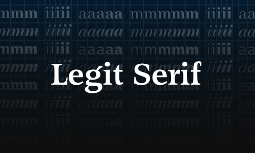
____ Legit Serif is an antiqua text font that features both optimal readability in small sizes as well as elegant aesthetics in display use. The standout feature of this typeface is its uniwidth system: all 18 styles are 100% compatible in width and remain swappable without altering the layout. It is also compatible with our Legit Sans family which shares the same uniwidth system.
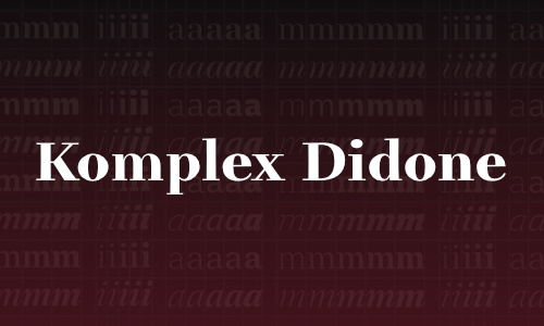
____ Legit Didone is a didone typeface that features both optimal readability in small sizes as well as elegant aesthetics in display use. The standout feature of our Legit superfamily is its innovative uniwidth system: all weights and styles are 100% compatible in width and remain swappable without altering the layout.
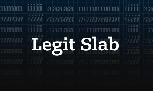
____ Legit Slab is a distinctive text font that features both optimal readability in small sizes as well as elegant aesthetics in display use. The standout feature of this typeface is its uniwidth system: all 18 styles are 100% compatible in width and remain swappable without altering the layout. It is also compatible with our Legit families which share the same uniwidth system.
____ A roman capital typeface, renaissance style. Individually shaped serifs and the absence of any geometric lines signify our humanist interpretation of the Capitalis Monumentalis. »Romis« features true small caps instead of a lowercase alphabet. It comes in six weights and adds a narrow oblique to every weight for maximum flexibility.
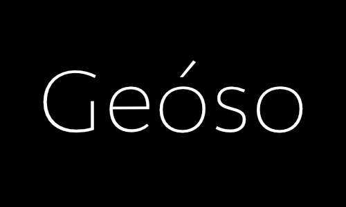
____ A humanist sans serif with geometric influence. Geóso comes in nine weights, with corresponding italics and true small caps. The uniwidth alignment system and a sophisticated number system, smart ligatures and contextual alternates make the difference. Strong accents to support 37 languages. OpenType features for sub- and superscript. Fitting Arrows and Emoticons.
____ A monospace typeface with unique character and beautiful spacing. Perfect for writing code and ready for use in corporate and graphic design. Monoflow is a fixed width font with human character for those who care about aesthetics & functionality. It stands out due to stunning readability, even in small sizes, and comes with distinctive bold and italics.
____ A decorative display font, derived from historical uncial scripts. Spiky terminals, rooted in vector construction, add a contemporary touch. This font works great for headlines, but at the same time offers unexpected readability even in small sizes. Distel currently supports more than 37 languages and comes with a set of beatiful alternates.
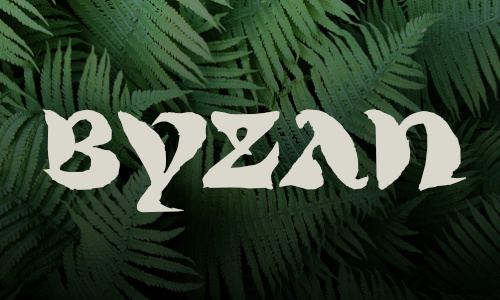
____ A brush display font, uncial style, derived from the historical shapes of the 5th century. Lowercase and uppercase letters differ only slightly; many alternative shapes provide a good amount of flexibility. The excessive brush style with its origin in formal calligraphy makes Byzan an excellent headline font.
____ Egyptienne / Slabserif. Die Kursive zeigt optimalem Kontrast zur Geradestehenden und keine Verklecksungen in spitzen Winkeln. Fokus auf Lesbarkeit in kleinen Größen, ohne Kompromisse in der Formqualität. Gemäßigte Serifenbetonung, um Mengentext in Print und Screen zu gewährleisten. Versalsatz in Finaltypequalität.
____ Klassische Antiqua an der Grenze zur Übergangsantiqua. Eine Kursive mit optimalem Kontrast zur Geradestehenden abgeleitet von Kursiven des ausgehenden 16. Jahrhunderts. Lesbarkeit in kleinen Größen, ohne Kompromisse in der Formqualität. Übergänge der Serifen zu den Schäften verlaufen eckig, jedoch nicht rechtwinklig.
____ Humanistische Serifenlose und eine Kursive mit optimalem Kontrast zur Geradestehenden, ohne Verklecksungen in den spitzen Winkeln. Fokus auf Lesbarkeit in kleinen Größen, ohne Kompromisse in der Formqualität. Weiche Schaftabschlüsse, um einer Scharfkantigkeit entgegen zu treten.
____ Classicist antiqua with reduced capital height and an italic with optimal contrast, influenced by the copperplate engraving style. Focus on legibility in small sizes without compromising the quality of shape. The hairline volume was optimized for small sizes.
____ Serifenlose mit Versalien in klassizistischen Proportionen. Die Gemeinen, vor Allem die kursiven Kleinbuchstaben, orientieren sich an humanistischen Formen mit optimalem Kontrast zur Geradestehenden. Der Fokus auf Lesbarkeit in kleinsten Größen, ohne Kompromisse bei der Formqualität.
____ Klassizistische Antiqua mit reduzierter Versalgröße in Kupferstichmanier. Eine Kursive mit optimalem Kontrast zur Geradestehenden. Fokus auf Lesbarkeit in kleinen Größen durch entsprechende Haarlinien. Kein mathematisch konstruktivistischer Formaufbau, sondern Formdetails nach dem Vorbild von Giambattista Bodoni.
____ Klassische Antiqua nahe der Übergangsantiqua (Barockantiqua / Transitional). Dazu eine Kursiv mit optimalem Kontrast zur Geradestehenden, abgeleitet von humanistischen Kursiven des 16. Jahrhunderts. Hervorragende Lesequalität in kleinsten Schriftgrößen, ohne Kompromisse bei der Formqualität.
____ Slab Serif (Egyptienne) im klassizistischen Stil. Die Gemeinen der Kursiv zeigen humanistische Merkmale mit optimalem Kontrast zur Geradestehenden. Der Fokus liegt, wie bei allen Fonts der Komplex-Superfamily, auf Lesbarkeit in kleinsten Größen — ohne Kompromisse bei der Formqualität.