Justification on the Web
Justified text is hardly used in professional web design these days. While a straight right margin could offer additional layout opportunities for modular designs and different screen sizes, the quality of justification in the browser is simply not good enough. Justified text on the web usually comes with uneven, extraordinarily wide gaps between words. This makes the text look unprofessional, at worst making it look like Swiss cheese: Web designers usually avoid justified text in general.
The reasons for poor quality justification in browsers are quickly summarised:
- Hyphenation: An important factor for acceptable justified text, which was not (or not easily) achievable on the web for a long time.
- Line-breaking algorithms on the browser are not very advanced. They are currently not taking advantage of all the technical possibilities already available in software for print design.
- The column width on the web is flexible by design. The lack of fixed margins makes it impossible for designers to interfere and correct the justified text manually.
That is why justification is not standard practice in web design. How can we use current technical advancements to improve digital justification?
As we learned in the first part of our series Gutenberg’s Justification: The quality of a typeset is defined by different parameters. The more parameters are involved, the less each individual paramenter needs to be adjusted, and the manipulation is less obvious. Intelligent, anticipatory decisions and a reasonable evaluation of which parameters to adjust – and by how much – lead to high-quality justification. When it comes to digital typesetting, we have more precise tools than we did with lead typesetting, and we should have more control over the parameters. So how come good justification is still a problem?
A closer look at the basics will help answer this question – and we’ll learn that something that might appear trivial is crucial in this matter: How do we handle line breaking?
Line Breaking
The importance of line breaking in digital typesetting cannot be overstated: The choice of breakpoints (positions where a text gets interrupted to start a new line) defines the quality of a typeset – be it justified or ragged alignment. Why is that? Donald Knuth and Michael Plass explain in the scientific paper about their famous justification algorithm:
»[…] the task of typesetting a paragraph with last century’s technology was conceptually a task of justification; nowadays, however, it is no trick at all for computers to adjust the spacing as desired, so the line-breaking task dominates the work. […] we shall use the term ›line breaking‹ in this paper to emphasize the fact that the central problem of concern here is to find breakpoints.« [1]
Rationing space within a line was the majority of the work effort with lead typesetting; For a computer, however, it is no challenge at all. Therefore we should bring intelligent and anticipatory line breaking to the center of our efforts.
Before Knuth and Plass, algorithms for justified text worked like this: You define a minimum and a maximum amount of space between two words. The computer puts word by word next to each other – with the regular amount of space in between. As it reached the word which exceeds the line the following rules are applied:
- If the word fits the line by minimising the space between all words (without undercutting the defined minimum), then break the line after this word.
- If that fails, try to increase the space between words (without surpassing the defined maximum) and break the line before this word.
- If both of these rules fail, use hyphenation and fit as many syllables into the line as possible.
- If there is no option to hyphenate, surpass the defined maximum of space between words. [2]
We see: the default parameter used by software like Microsoft Word to create justified text is the space between words. If this leads to an undesirable result, there are further options. Changing the space between letters is a bad practice: Disregarding a bad appearance, increasing the space between letters used to be a way to emphasize certain words in a text, which could lead to misunderstandings. Some text processing software uses additional parameters, such as kerning or optical margin alignment, to reach the desired length of a line. One of the most important and essential factors for good justified text is the availability of hyphenation.
Hyphenation
First and foremost, hyphenation ensures that more predetermined breaking points are available for line breaking so that the space between words does not spread too far – creating unsightly large holes in a text. In the German language this is an even bigger issue, since words tend to be relatively longer: hyphenation is a must.
A big problem of justified text on the web used to be the lack of hyphenation support in browsers. Luckily, this issue has been partly resolved, as all major browsers now support automatic hyphenation by hyphens: auto [3]. Even better, more granular control over line breaking is still important and thankfully on the horizon with the implementation of CSS Text Module Level 4 [4]
Justification Algorithms
In many situations, the computer has to choose: decrease the space between words to fit one more word/syllable into the line, or instead increase the space and move the word into the next line. The algorithm in the example above always chooses the option that creates the least amount of holes in that line of text. But every one of these decisions ultimately also influences the next line, and the one after that. Hence it might sometimes be sensible to accept smaller problems in order to avoid a bigger issue down the line.
Typesetters in the 15th century were able to plan, at most, a few lines ahead, so they could react early if they ran out of space. The abilities of a computer surpass the foresight of a human typesetter by far. By going through the entire text, and assessing all possible outcomes, a justification algorithm can calculate the ideal points for line breaking – while taking into account all of our parameters: word spacing, hyphenation, kerning and optical margin alignment.
The algorithm does not only look at single lines, it has the ability to plan ahead. While calculating all options, it measures the variance in word spacing and gives a penalty point for any use of hyphens. In the end, the algorithm has found a winner and exactly these points for line breaking will be used on the text.
»Experience has shown that significant improvements are possible if the computer takes advantage of its opportunity to ›look ahead‹ at what is coming later in the paragraph, before making a final decision about where any of the lines will be broken. This not only tends to avoid cases where the traditional algorithm has to resort to wide spaces, it also reduces the number of hyphenations necessary.« [5]
The most prominent example for such an algorithm was developed in the 1980s by Donald Knuth and Michael Plass (you’ve met them earlier in this text).
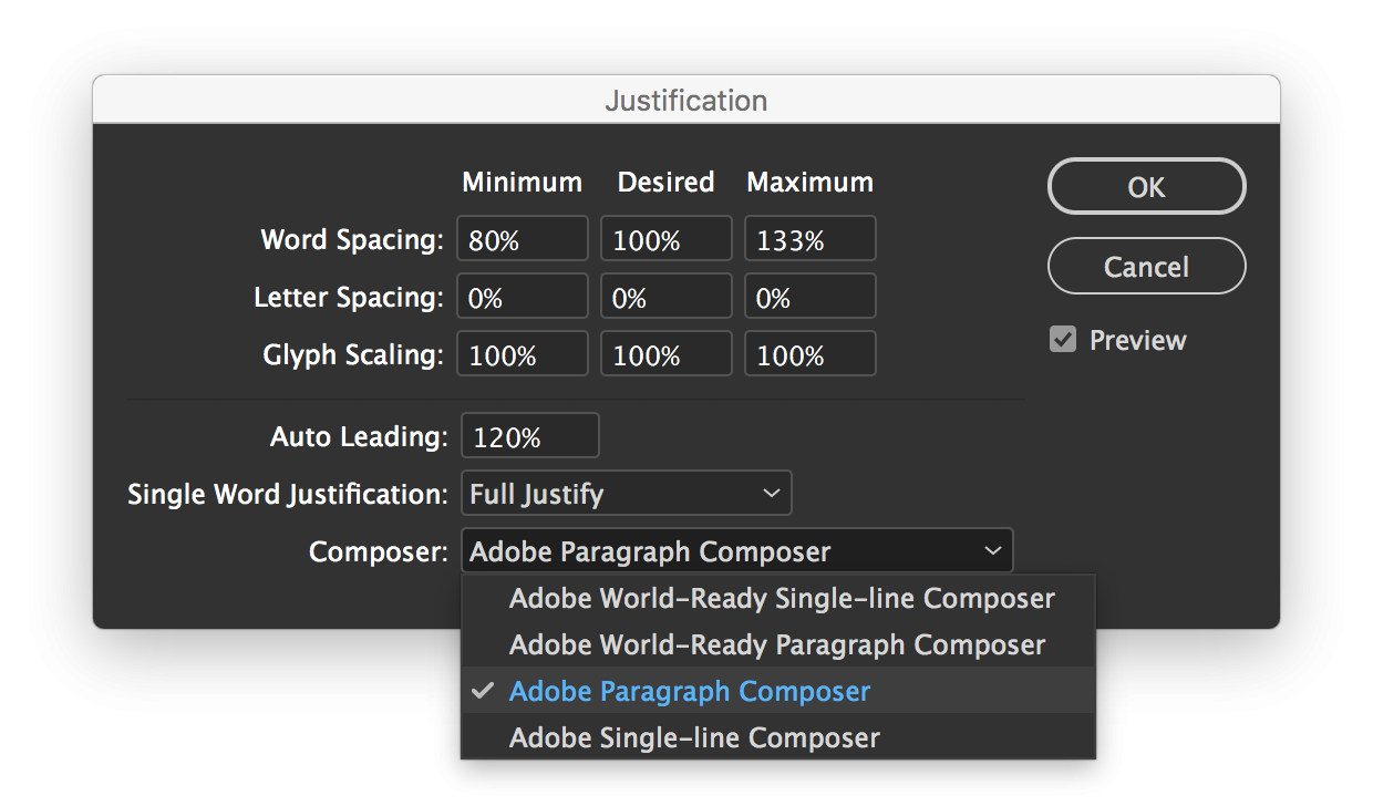
The Knuth-Plass-algorithm was used mostly in the typesetting system »TeX«, which was developed mainly by Donald Knuth. A similar algorithm is used today by Adobe InDesign. The paragraph settings allow choosing between the Adobe Single-line Composer and the Adobe Paragraph Composer. The latter is based on the principle of an anticipatory algorithm, which we just laid out above. It does not look only at the current line but at the entire paragraph when it calculates line breaking.
Justification on the Web
Considering this satisfying solution for digital justified text through current software, justified text on the web today is a total disaster. We are facing a multitude of problems: Designers don’t have enough influence on the web to change text parameters. With print products, settings can be manually adjusted; on the web, a designer forfeits control of the outcome. Websites cannot be designed pixel perfect, they are rendered by all kinds of different devices – and the browser calculates line breaking individually each time a website loads, depending on screen size. Subsequent amendments to the line breaking can therefore not be performed. As with many areas of design, the designers will have to to implement universal rules that are as flexible as possible – in order to deliver the best outcome possible despite ever changing conditions.
However, for reasons beyond our understanding, typeset on the web remains far behind of what is already possible. The most important example: The Knuth-Plass-algorithm. Even though Implementing it into the browsers would increase the quality of justified text substantially, browser makers so far have failed to do so. While text quality in programs like Indesign and LaTeX benefits greatly from the abilities of a computer, browser makers still rely on the simple, insufficient »first fit« algorithm. Taking into account that automatic hyphenation was implemented by most browsers only recently, it is evident that the conditions for justified text on the web are terrible. Refraining from using justified text on the web used to be the only sensible choice. (I reject this status quo, and my recommendations for improved justified text on the web can be found in part 3 of the series).
Back in 2009, Bram Stein, a software developer and now product manager at Adobe, ran a substantial experiment: He recreated an implementation of the Knuth-Plass-Algorithm in javascript. His script can be added to any website and automatically calculates and uses the ideal line breaking for a paragraph and therefore significantly improves the quality of justification. Since his extension can only adjust text after it has already been rendered – by wrapping every line into a <span> and adjusting the word-spacing – this solution is not entirely ideal. The high-level implementation of course has a negative impact on performance (even though the demo works like a charm) – however, it spectacularly demonstrates the potential of such an algorithm. Browser makers have the ability to implement the algorithm in a much more low level way, directly into the text rendering engine, with less impact on performance. In conversation, Bram Stein told me why this useful technology is still not available on the web:
»The answer I hear most often is performance. The algorithm is much more expensive than the simple greedy algorithm. Browsers need to recalculate layout much more often than design tools (such as InDesign and TeX) because of changes to the page (i.e. interactive stuff, JavaScript, styles loading, etc.) However, there are some pretty fast (linear-time) implementations of the Knuth/Plass algorithm, so I don’t think that is a very strong argument. Processing power has also increased a lot compared to, say, 10 years ago. I think the more likely answer is unwillingness to change something so fundamental to a browser layout engine. Changing the line breaking algorithm will impact pretty much every aspect of the layout algorithms, so implementing it now will be a huge effort.«
Improve Justified Text on the Web
There is more to improving justified text on the web; advanced line breaking is just one of many parameters. As we have seen: When creating print products, designers had the ability to influence and improve the justification of a text for decades. In addition, new technological developments, like variable fonts, demand we work on better justified text. What this means specifically is explained in the third part of our series about justified text. → Better Justification .
This article is based on the master’s thesis of Johannes Ammon »Blocksatz im Web – Verbesserungen durch Algorithmen und Variable Fonts«. Johannes graduated in 2019 from the master’s program Gutenberg Intermedia | Type + Code at Hochschule Mainz. Many thanks to Lara Wiedeking and Jan Barow for supporting the English translation of this article.
- Knuth, Donald E. und Michael Plass: Breaking Paragraphs into Lines. In: Software: Practice and Experience, vol. 11, 1981, S. 1120
- comp. Knuth, Donald E. und Michael Plass: Breaking Paragraphs into Lines. In: Software: Practice and Experience, vol. 11, 1981, S. 1120
- comp.
- comp.
- Knuth, Donald E. und Michael Plass: Breaking Paragraphs into Lines. In: Software: Practice and Experience, vol. 11, 1981, S. 1120