Capital Sharp S (ẞ)
A capital version of the german sharp s
Since 2017 the capital sharp S (ẞ) is part of the official german ortography [1]. As many other typedesigners, we have been integrating it into our typfaces for quite a while. Now that this additional glyph has been officially added to the alphabet, German and international typedesigners might wonder: How should a capital sharp S look like? An opinion piece by Prof. Hans R. Heitmann.
Historical consideration: SS or SZ?
It is commonly assumed in the design scene that the shape of the german sharp s (ß) derives from a ligature of the historical long s and tailed z in blackletter typography, and therefore typedesigners tend to design the ẞ referring to these two letters. However, there is also evidence indicating that it derives from a ligature of long s and round s. In my opinion, this question cannot be answered definitively. There were numerous combinations from as early as in the 7th century and a lot of research can be found on the matter – including the work by Georg Salden [2] or by Max Bollwage and Herbert Brekle.
Personally, I doubt that the ß in in black letter (from the 15th century onwards) has arisen exclusively from the ligature sz. My investigations in the Theuerdank of 1517 support this thesis and show four different s-forms. (see fig. 3) After my investigations I have come to the conclusion, similarly to Jan Tschichold, that in both antiqua and black letter scripts from the 16th century onwards the sharp ß represents the ligature of long and round s.
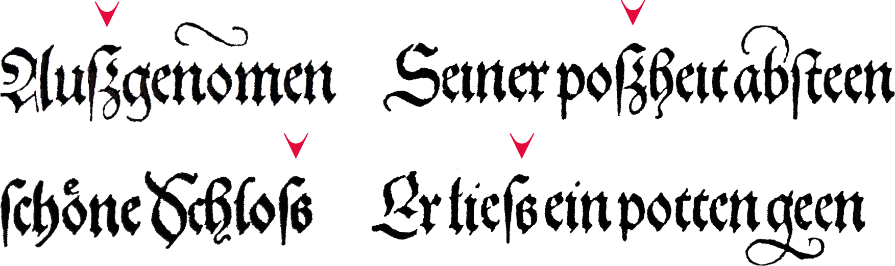
In my opinion, the ligature from s and z could also be a »visual misunderstanding« (see Fig. 4). Both versions can be found in the same text (e.g. Theuerdank). One might look for a clear answer in the past 500 years then – a possibly futile endeavour, which might lead to a result not fit for the requirements of the 21st century (such as readability and consistency).

Much more relevant than the final clarification of the origin of the ligature would be the development of a functioning shape for this new capital letter, with a focus on the reader of the 21st century.
ẞ as capital letter in the 21st century
If we want to focus on the habits of the recipients and ensure a responsible design for use in the 21st century, a form derivation from long ſ and round s is clearly preferable. Especially in terms of internationality, the forms that include a distinct s shape are convincing.
Rules for a better capital sharp S
For the development of this new capital letter and its stylistic integration into our existing uppercase alphabet, I consider the following attributes of primary importance:
- monumental (capital) appearance
- clear distinction to the other glyphs of the alphabet, but also stylistic harmony
- similarity with the shape of the common ß in antiqua typefaces
- integration of the regular s-shape (for better identification)
- treatment of the left shaft as an abstract element (since the long ſ is becoming less and less known)
ẞ in alphabetic context
If we look at the basic structure of the Capitalis Monumentalis, which is the origin of our modern capital letters, it becomes obvious that the Roman letters are, on the one hand, clearly distinguishable from each other – but at the same time share a stylistic connection. To me, this is what constitutes their quality and justifies their use over 2000 years.
If another figure is added, it must be different from all others; yet the reading habits of the recipients play a major role in the design as well. For example: A similarity to the common ß makes it more easily recognizable and therefore should be taken in account by type designers.
Appeal to type designers
To all type designers wrestling with the design of their capital sharp S, we would like to suggest: Ignore the z in this context and integrate the regular, round, Roman S into the glyph. Only then will the letter be recognized as such and not be confused with the B – everything else makes impedes reading.
Capital sharp S in Finaltype Fonts
All Finaltype fonts include at least one capital sharp S (ẞ) Unicode U+1E9E, and some fonts also contain variants. However, since there is no obvious way to type this additional letter on common keyboards, here are some notes:
Most of our fonts have integrated rules for automatic replacement via the calt opentype feature. If a small ß is used in between uppercase letters, it will automatically be replaced by a capital ẞ. To make this magic happen, the calt feature (contextual alternates) must be activated, which should be the default preference in most layout software and web browsers. If, in exceptional cases, the replacement is not desired, calt must be deactivated for the relevant paragraph.
ẞ in Adobe InDesign:
Unfortunately, the automatic text conversion of InDesign (menu entry »Change Case« or button »TT«), still replaces the ß with SS – even if the font comes with a ẞ. While this was the correct behaviour according to the previous rules, it has now become a nuisance. The same applies to the CSS command 'text-transform: uppercase' on the web which is not aware of the capital sharp S.
In some fonts, we additionally integrated the capital ẞ via the stylistic set feature ss01, so it will be suggested as an alternative in software such as Adobe InDesign. (OpenType suggestions in the text frame currently depend on the use of Adobe paragraph composer, so make sure it is selected in the settings of the paragraph pane)
Many of our fonts also contain small caps. To prevent InDesign from replacing the regular ß with SS, the World-Ready Paragraph Composer must be selected for the corresponding paragraph.
Keyboard shortcuts for use on MacOS, Windows and Linux can be found in this Medium article by Christoph Koeberlin.
There are many words in the German language which contain the sharp s (ß). Especially when it comes to names, habits play an important role for the acceptance of a letter. The risk of confusion with the capital B is enormous: In international communication, affected persons often get their name back with B instead of ß (e.g. LEIBER instead of LEIẞER, RIEBNER instead of RIEẞNER).
From our point of view only the shape with the round s is ideal (e.g. GRUẞ). Personal surveys support this independently of historical derivations. Ultimately, improving readability should be the top priority for communication designers and type designers.