Better Justification for the Web
Hyphenation
For the longest time, the main reason for the very poor quality of justified text in browsers was the lack of proper hyphenation, an issue especially in languages like German, where words tend to be very long.
Luckily there has been a lot of improvement in the past years: Since 2011 automatic hyphenation is broadly available through hyphens: auto. Meanwhile this CSS property is supported by all major browsers and therefore adds automatic hyphenation (at least for some languages). But still: the typographic options of web designers remain far behind of what is possible in common dtp software like Adobe InDesign.
A more fine-grained control over hyphenation will most likely arrive with CSS Text Module Level 4. Richard Rutter wrote a great summary of the new possibilities. For example, hyphenate-limit-chars will allow us to define a minimum amount of characters before and after hyphenations. We will be able to limit the number of consecutive hyphenated lines with hyphenate-limit-lines and the hyphenate-limit-last property prevents hyphenated words across the last line of a paragraph. With special interest I look at hyphenate-limit-zone which reduces hyphenation by defining a hyphenation zone. [1]
In my opinion, we need an even more extensive control over hyphenation on the web. Especially for crucial words or technical terms that are not covered by the browsers’ dictionaries, it would be nice if content producers could predefine the breakpoints through something like soft hyphens with different priorities: »If you really have to hyphenate, try here first, try there if necessary, but under no circumstances at that part of the word«. At least for headlines, this would be a game‑changer.
Justification Algorithms
The technology for advanced line-breaking algorithms which look ahead and calculate the optimal breakpoints to improve the typesetting already exist, as we explained in detail in part two of our justification series. Still, even in 2020, none of the browsers have implemented such an algorithm. The line-breaking algorithms used today only consider the current line for their hyphenation choice. If it doesn’t fit, it breaks the word – no matter what follows.
Contemporary alternatives, such as the Knuth and Plass line breaking algorithm, take the whole paragraph into account to calculate the most ideal breakpoints: »If I (the algorithm) squeeze this word into line one, to minimise wide gaps, what does that mean for line two and three – and does this potentially create even larger gaps in line four?« That way, an entire tree of possibilities gets created, out of which the algorithm chooses the most ideal solution: The version that will be ultimately applied.
Bram Stein demonstrated that advanced line breaking is able to significantly improve the quality of typeset on the web with his javascript implementation of the Knuth and Plass line breaking algorithm . His attempt from eight years ago also proves that the often pleaded performance issues can not serve as an excuse for not implementing it in modern browsers (considering that a native implementation would be much more low level and even faster than Brams javascript solution).
It is therefore imperative we demand the implementation of such an algorithm by the browser makers.
»Soft Justification«
Another approach to improve justification on the web would be giving algorithms a more human touch. Let me explain this theory by taking a look back to Johannes Gutenberg.
In his book »Studies about the history of the beginning of letterpress printing« (»Untersuchungen zur Geschichte des ersten Buchdrucks«), the German librarian Paul Schwenke said: »Keeping the exact amount of space between words does in a way contradict ensuring the complete uniformity of the length of lines.«
He finds that Gutenberg’s justified text is not considered one-of-a-kind because of its perfect alignment, but because of the even spaces between the words. Schwenke explains that for Gutenberg, »a uniformity of the line length was desirable, however, even lines were even more desirable.« [2]
Case in point: When we take a closer look at the justified text of the Gutenberg-Bible, we learn that the length of the lines is not always identical – sometimes not even close:
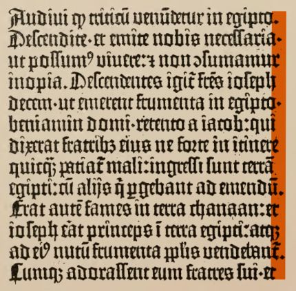
Sometimes the typesetting creates extreme cases, in which exceeding the defined length for the line may be the lesser evil. In the past, human typesetters were able to make individual decisions based on previous experience. In contrast, algorithms are programmed to meet an exact value that needs to be met down to the last pixel. If the end of a line is exceeded even by just a pixel, the line will break – without taking the space between words into account.
We need a softer approach to how we handle line lengths: A tolerance zone for line-breaking and something like predetermined (semiotic) breakpoints (such as soft-hyphens of multiple order).
Such a tolerance zone – as ison the way with CSS Text Module 4 in the context of hyphenation – would make a huge difference when combined with the Knuth and Plass algorithm. If even spaces between words and avoiding hyphenation become a priority, and the precise length of the line down to the last pixel is not the only goal anymore, we will have way better and much more readable justification on the web.
Let’s use Gutenberg as an inspiration to improve justification: In exceptional cases, the algorithm needs to be able to break the fixed length of the line, just like a human typesetter would do, and therefore reach something I would like to call »soft justification«.
Varying the Width of the Letters
The more parameters are available to adjusted the length of a line, the better the quality of a justified text will be. When every single parameter is only slightly adjusted, the individual adjustment (for example the space between words) is less noticeable.
One example of an additional parameter that could be used for an improved justification is the width of the individual letters. This idea is anything but new: in part one of this series »Gutenbergs justification«, I demonstrate how Gutenberg made use of several variations of the same letter to improve his typesetting.
In the early 1990s the calligrapher and type designer Hermann Zapf got together with Peter Karow and Margret Albrecht from URW to develop a typesetting program able to replicate the quality of the Gutenberg-bible. The so called »hz-program« combined the advantages of the Knuth and Plass Algorithm with another parameter: variation in the width of the letters. [3]
This technique of »glyph scaling« is not about varying the amount of space between the letters, but instead changing the size of the letters themselves: it’s about compressing or expanding the shapes. The technology behind the hz-program was eventually purchased by Adobe – probably in order to integrate it into Adobe InDesign. It is unknown whether the code of the hz-program is actually integrated in the current version of Adobe InDesign [4] as the functionality of »glyph scaling« in InDesign differs from the hz-program in a very crucial aspect. InDesign horizontally distorts the letters and does not compensate the differences in the stroke width of the vertical stems, resulting in letters with a weird contrast and terrible shapes. Peter Karow and Hermann Zapf always compensated those distortions and kept the original stem width – therefore the letter »i« could not be scaled at all, the letter »m« however fairly easy. [5]
Glyph scaling needs to be taken with a grain of salt, and it surely is not implemented well in Adobe InDesign. But in combination with the other parameters available to improve justified text, it could be a very useful tool. What if we find a way to keep the original stem width and don’t distort the letter shapes at all?
Better justification through variable fonts
In 2016, a feature was added to the OpenType standard called »OpenType Variations« – which enabled us to create »variable fonts«. In contrast to regular font files, variable fonts can contain several different master typefaces in one file. The browser is then able to smoothly interpolate between these path-compatible master typefaces. There are many advantages to this technology like reduced filesize and fewer requests on a webpage when including several font styles. Web designers can now adjust the appearance of the typeface using CSS to work properly in responsive environments, and can even animate it.
Variable fonts are very interesting for our issue with justified text, as it is fairly easy to create a font featuring an axis with narrow letters at one end, and an expanded version on the other. Hence, variable fonts allow for the shapes to be adjusted in a dynamic way – without distorting the shape of the letter, since both masters had been designed in advance by the typedesigner. Flexible width of the letter while retaining balanced stem widths – this is exactly what Herrmann Zapf wanted to accomplish with his hz-program. In order to achieve slightly shorter or longer lines, the font does not have to be squeezed or distorted as Adobe Indesign does: Type designers can now carefully craft several versions of a typeface in advance. Completely detached from this process, on the user side, a justification algorithm can ask the variable font for a lower or higher value on the wdth-axis to fit its current needs and doesn’t need to care at all about design decisions.
The broad support for variable fonts in browsers was the basis for the hands-on part of my master thesis: Improving justification from the perspective of a type designer. At the 2018 Robothon Conference in Den Haag, Bram Stein demonstrated a modified version of his javascript implementation of the the Knuth and Plass Algorithm. He included an additional parameter: »variable fonts«, and was able to reduce the variability of the word-spacing drastically. A prime example of how justified text can be improved through variable fonts.
Aside from this very technical approach, additional aspects of type design are worth considering. From Gutenberg we have learned about the advantages of abbreviations and ligatures and how they improve the appearance and quality of the typeset. From the point of view of a type designer: What requirements would a font have to fulfill if we pick up on these historical ideas, but also combine them with our latest technological improvements?
Improvements through Typedesign
My hypothesis: With a special font, created exactly for this purpose, in combination with a modified line breaking algorithm, we can improve the quality of justified text on the web significantly.
Starting point for the implementation was a slab serif typeface by Prof. Hans R. Heitmann. Even though there are no condensed and extended styles of this typeface, it seems robust enough to cope with a flexible adjustment of the glyph widths. [6]
Starting from the regular style of »Arccus Slab« I tailored a variable font dedicated to our purpose. Our goal is to change the letter shapes in a way that is as unobtrusive as possible. That’s why it’s essential not to widen or shrink the whole font equally, or even distort it, but rather systematically analyse the very different scope of action for every letter individually.
Even though every letter has to be dealt with individually, I tried to group them to get an idea of the scope of action and the possibilities for flexible width.
Then I carefully varied the width of the letters individually depending on their capabilities to eventually get to one narrow and one wide master. Very important in this stage is to preserve the grey value (type color) of the regular style in order to avoid darker or brighter spots that could make the manipulation more obvious and/or irritate the reader.
For example: When changing the counter of a letter, I instantly try to compensate this change in type color by adjusting the serifs or changing the shape itself so it matches the original again.


In the next step I created some smart alternatives, again in reference to Johannes Gutenberg who used different variants of the same letters to improve his typesetting. In Glyphs.app you can use the Bracket-Trick to make variable fonts alternate between different shapes. The interesting part of this method: the values of the breakpoints (»When does it flip to the other shape?«) can be defined individually for each glyph, which we should definitely make use of to get the best results.
Asynchronous wdth‑Axis
A critical aspect of my solution is the approach of using the wdth-axis in a non-linear or asynchronous way. The idea is to not shrink and expand the letters equally (like the condensed or expanded styles of common typefaces) but to instead manipulate them according to their capabilities or alternate the shapes completely as soon as a specific glyph reached its limits.
At one end we have a standardised system, the wdth-axis, which can be used by a line breaking algorithm to ask for extension or compression without caring much about what that will mean for the typeface. On the other end, several things can happen: Letters shrink, serifs disappear, shapes get altered. But it just looks good.
The advantages of this architecture: The authority controlling the line breaking algorithm (browser makers) do not have to care too much about type design, but only give the information »narrower« or »wider« to the variable font. The individual design decisions are the type designers’ responsibility.
Experimental Ligatures & Abbreviations
To take this a level further, I integrated some experimental ligatures and abbreviations to reach a more extreme variability of my font. Sadly it’s not possible to integrate those in a useful way into the wdth-axis, but the line breaking algorithm could turn them on or off line by line.
Even though ligatures in general are controversial because of their negative effects e. g. on readability, I wanted to test their potential contribution to justification – again in the tradition of Johannes Gutenberg. I started with common ligatures known from historical prints but also tried to find the most common letter combinations in German and English to add some new ligatures that will have a lot of impact on the length of a line. Of course, this is an experimental approach that does not concerns itself too much with readability.
In tradition of Johannes Gutenberg we could also try to add a contemporary equivalent to the innumerable abbreviations he used to cheat his way to the perfect justification.
A line-breaking algorithm for example could abbreviate some common words or replace them by a symbol (Dollar → $, and → &) when it has to further shrink a line. And just imagine all the possibilities with emoji. 🙃 I am aware that this would cross a line, as content would be manipulated in a significant way and meaning could be distorted – just because of some kind of dogmatic reverence for aesthetics.
I was a little surprised when I found out that even this idea was already implemented by someone before. The Vietnamese scientist Hàn Thế Thành, who was in charge of the implementation of glyph scaling in pdfTeX, already worked with experimental abbreviations to improve justification referring to Johannes Gutenberg. In his dissertation on a microtypographic extension for the TeX typesetting system are several approaches that Han The Thanh himself describes as »heavy experiments«. [7]
Putting it all together
In order to reach the goal of better justification on the web with the help of a dedicated variable font, it is essential to establish a deep connection between line breaking technology and typedesign. The line breaking algorithm, which is responsible for the justification, has to be somehow aligned to the features of such a font. I see two main demands:
- The line breaking algorithm has to be extendable by one or more additional parameters (variable font, ligatures)
- The possibility of prioritising parameters during the line breaking process – or at least the possibility to set the order in which the parameters are used.
Sadly there is (as far as I know) currently no way of hooking into the browser’s line breaking algorithm and extend it by any of the functionality outlined above. The line breaking is part of the text rendering process and happens deep inside of the layout engine. That’s why I had to come up with a different solution to test my font. I hacked together a simulation of the browser’s line breaking algorithm in javascript. The principle is very simple, as I lay out in the second part of this series. The important difference is my ability to hook into the typesetting at any part of the process.
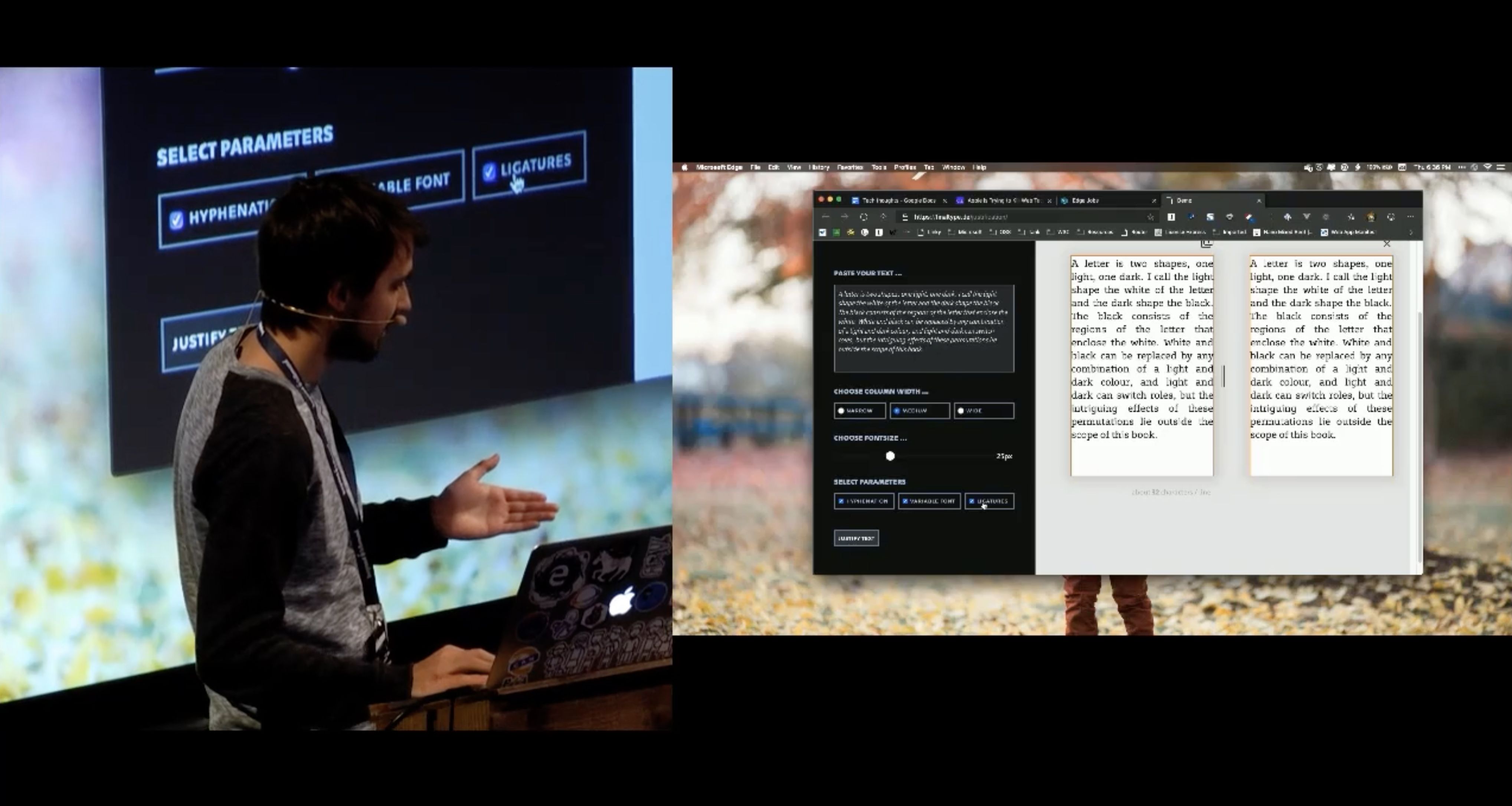
I created a tool which can be fed with german or english copy and will transform it into a justified column of text. Several parameters (hyphenation [8], variable font and experimental ligatures) can be activated via checkboxes. I think the potential achievements for justification on the web through the methods of typedesign are made quite tangible with this tool. → check out live demo
Demand Better Typography!
Until now, digital typesetting, especially on the web, stays far behind its technical possibilities. The implementation of the Knuth and Plass line breaking algorithm into the browsers’ layout engines is overdue.
In addition, type designers could make their contribution for better justification by establishing a creative use of the wdth-axis of variable fonts. For these kind of improvements we certainly need more control over the line-breaking in browsers in the form of hooks to add our own parameters. I believe that the full potential can only be reached by a deeper collaboration of web typographers, type designers and browser makers.
Progress in web typography is possible, as the gradual advent of automatic hyphenation shows. Even though the way to a broadly available solution is really hard, and may take some time, a realistic estimation of our scope for action reveals: If we keep demanding better typography for the web, and constantly question the status quo, we will eventually achieve progress.
The implementation of a Knuth and Plass line breaking algorithm can be a first step and is kind of a low hanging fruit by now. Bram Stein told me in an interview for my master’s thesis:
»I think the best way forward is to get the line breaking algorithm standardised as an opt-in CSS feature. That way, browsers interested in implementing Knuth/Plass could do so and web developers can enable it. Once we see some real-world usage it might motivate other browsers to implement it as well.«
In this article I also lay out the idea of »soft justification«, the possibility for the line breaking algorithm to break out of the fixed bounding box and to prioritise the parameters in a flexible way. To gain real progress for web typography we need both: The creativity of designers to use currently available technology in a new way and open ears and some courage from the browser makers.
This article is partly based on the master’s thesis of Johannes Ammon »Blocksatz im Web – Verbesserungen durch Algorithmen und Variable Fonts«. Johannes graduated in 2019 from the master’s program → Gutenberg Intermedia | Type + Code at Hochschule Mainz. Many thanks to Lara Wiedeking and Jan Barow for supporting the English translation of this article.
Further reading
→ Hypher.js by Bram Stein
→ Javascript-Implementation of the Knuth and Plass line breaking algorithm by Bram Stein
→ fit-to-width.js by Laurence Penny → Codepen
→ Newbreak by Simon Cozens → Demo
→ Simon Cozens on making JSTF better
Got more? Please contact me via mail or Twitter @helloammon .
- The algorithm always tries to reach the optimal lenth of the line, which sometimes leads to a lot of hyphenations. By defining a tolerance zone with hyphenate-limit-zone, you can define a maximum white space that is acceptable at the end of a line. This enables the algorithm to reduce the number of hyphenations.
- comp. Schwenke, Paul: Untersuchungen zur Geschichte des ersten Buchdrucks, Königliche Bibliothek zu Berlin, 1900, S.41
- comp. Zapf, Hermann: About micro-typography an the hz-program, in: Electronic Publishing V6(3), 1993, S. 286
- Wikipedia: Hz-program, https://en.wikipedia.org/wiki/Hz-program, 19.12.2018, 17:30 Uhr
- Eng, Torbjørn: InDesign, the hz-program and Gutenberg’s secret, <http:// www.typografi.org/justering/gut_hz/gutenberg_hz_english.html>, 19.12.2018, 17:30 Uhr
- Not every typeface is suitable for this purpose since for some typefaces the horizontal proportions are very important (e. g. the roman capitalis).
- comp. Hàn Thế Thành: Microtypographic extensions to the TEX typesetting system. Masaryk University Brno, 2000
- For the simulation of hyphenation i used Hyper.js https://github.com/bramstein/hypher by Bram Stein