Benedikt
Buy Benedikt via Fontspring →A font with character
Benedikt comes with many unique characteristics. Some of them catch your eye, but are still highly functional and improve readability; others are more subtle – in a way that users and readers rarely actively notice. All of them together evoke a sense of diversity and humanity.
Many details and variants in this font show up automatically thanks to a large number of integrated OpenType features. Users don’t have to bother: It just looks good!
calt OpenType feature to improve the type color and evoke a warm character. These small details are what makes »Benedikt« stand out. Stylistic roots
The design of the Benedikt family is rooted in our custom work for the Hans-Benedikt foundation in Augsburg. These custom capital letters made out of stainless steel demonstrate our affinity for Roman monumental writing.
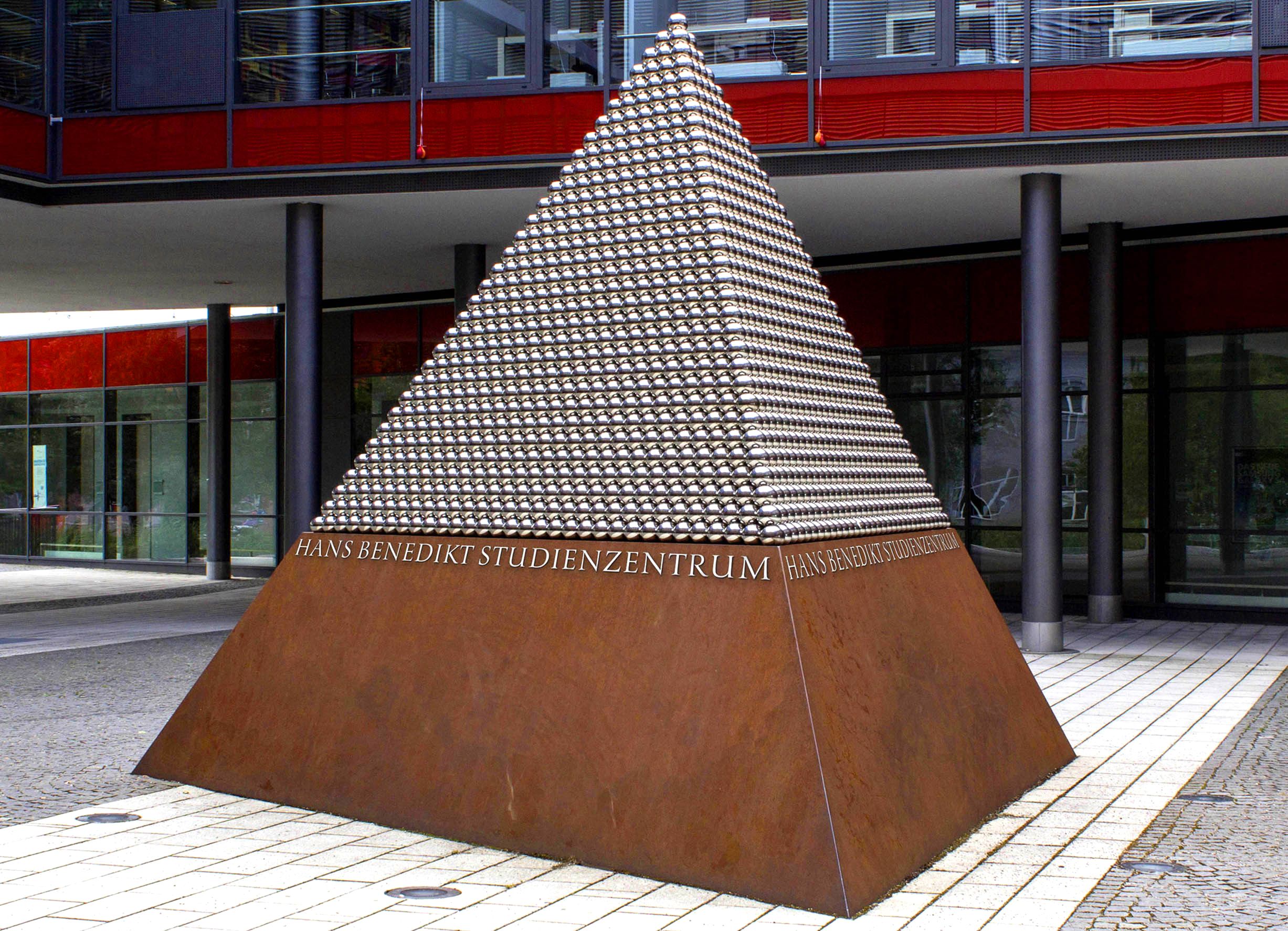

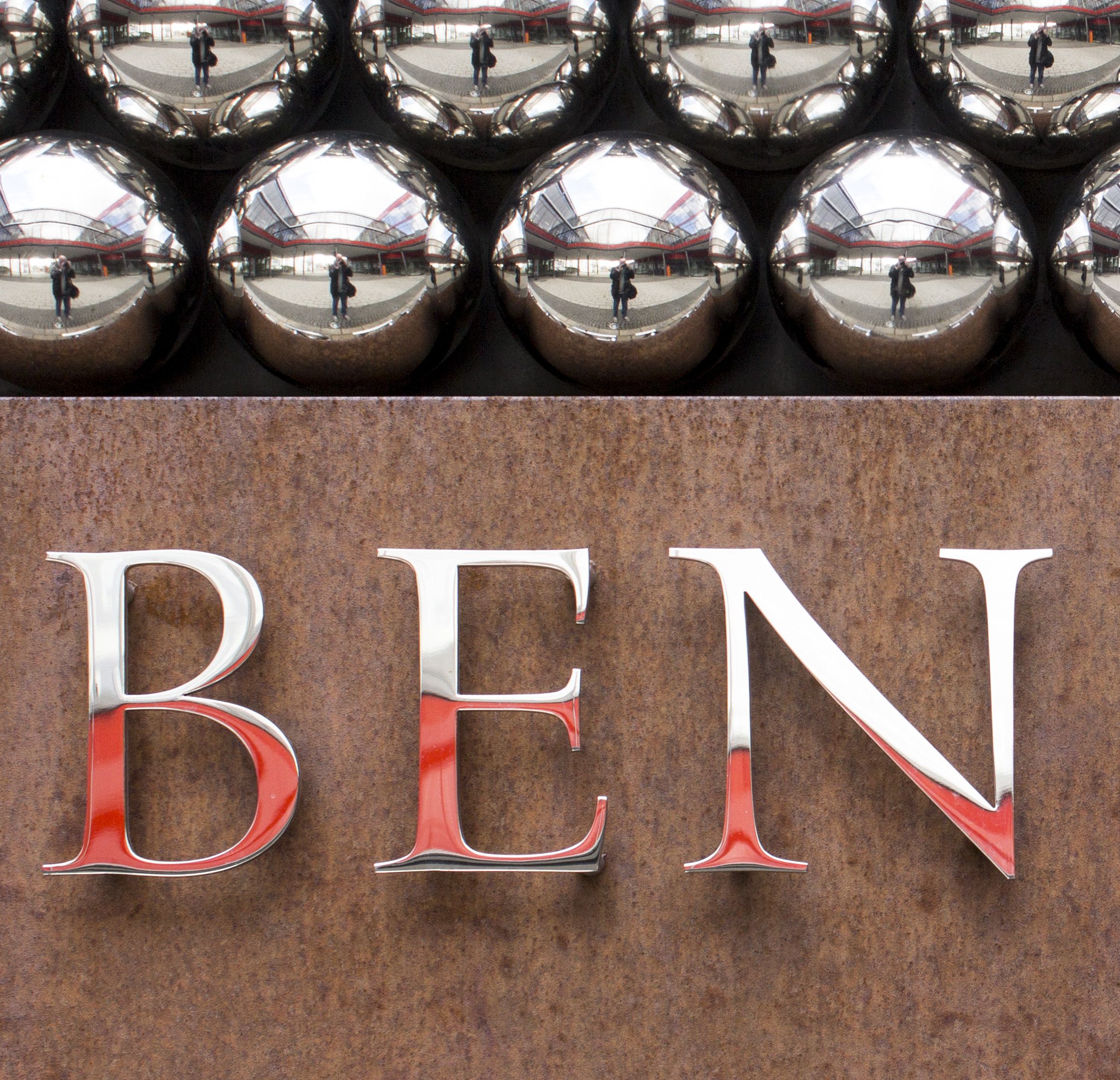
The challenge now was to design additional members of the type family. First came the upright lowercase letters, which retain the monumental character of Roman capitals. They stand out from the usual antiqua approach – and therefore have a Roman appearance, e. g.: columnar shafts, a symmetrical structure and an uppercase R on x‑height.

Provocative Italics
Of course, a matching italic is also needed. We refrained from using italics from the 16th century as a starting point, as in our opinion they are more representative of the calligraphic developments of the 15th and 16th centuries than of an actual rediscovery of antiquity. Therefore, they show a great distance to Roman shapes and are not the suitable in this case.
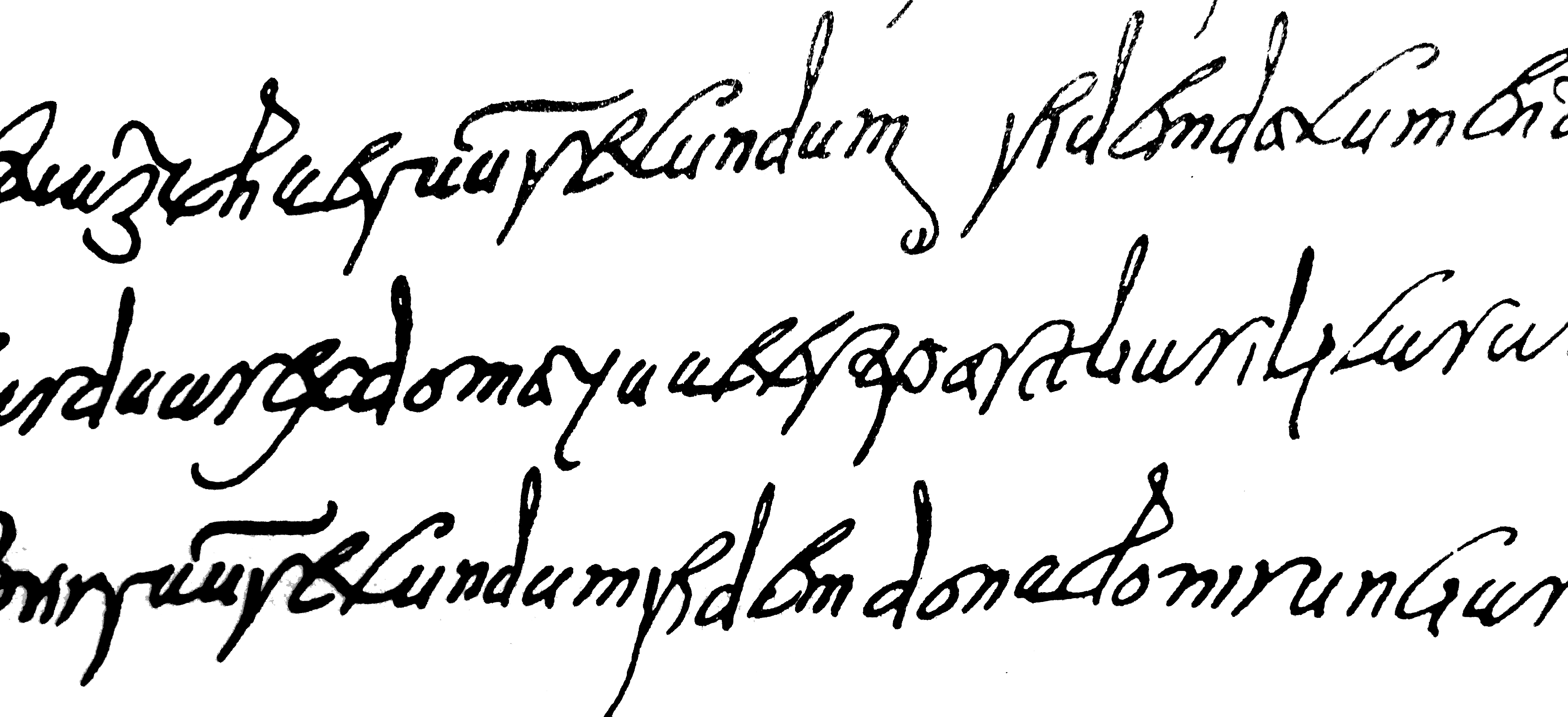
Roman italics were carved into wax tablets (among others). These slender shapes without significant stroke contrast served as the source of inspiration for Benedikt Italic, which is in turn reminiscent of contemporary rounded fonts. According to our Finaltype philosophy, the distinguishing character of an italic must be absolutely guaranteed! In the case of this unusual combination (upright fonts with monumental character and italics with wax tablet character), highlighting is very distinct. Benedikt Italic in combination with the upright version is therefore completely new, excels in performing its intended function, and is historically justified to boot.
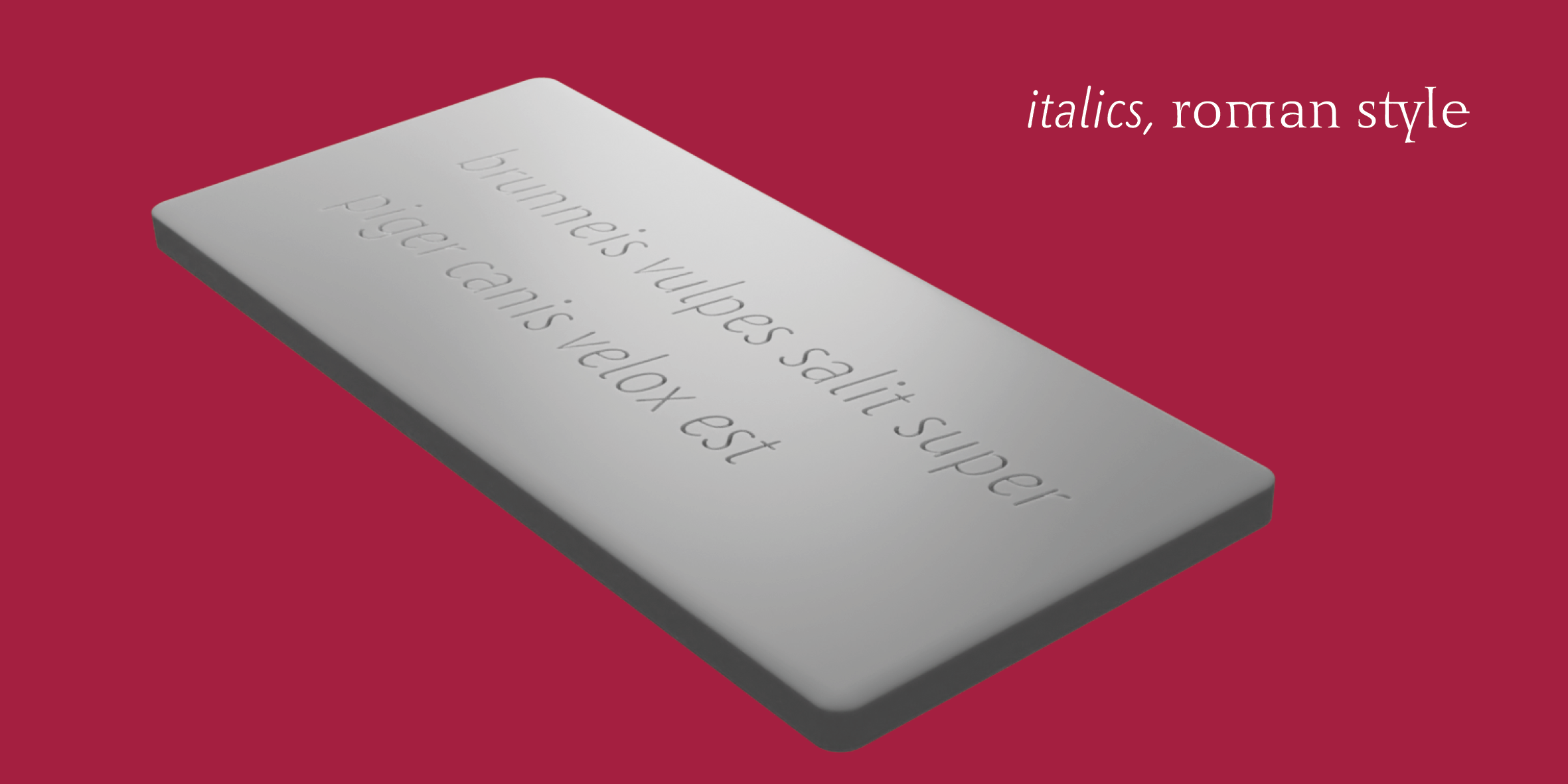
True Small Caps
»Benedikt« contains true small caps, which integrate well into the text and qualify this font for professional use cases. The small caps include diacritics, numbers and currency symbols als well as fitting mathematical operators.

