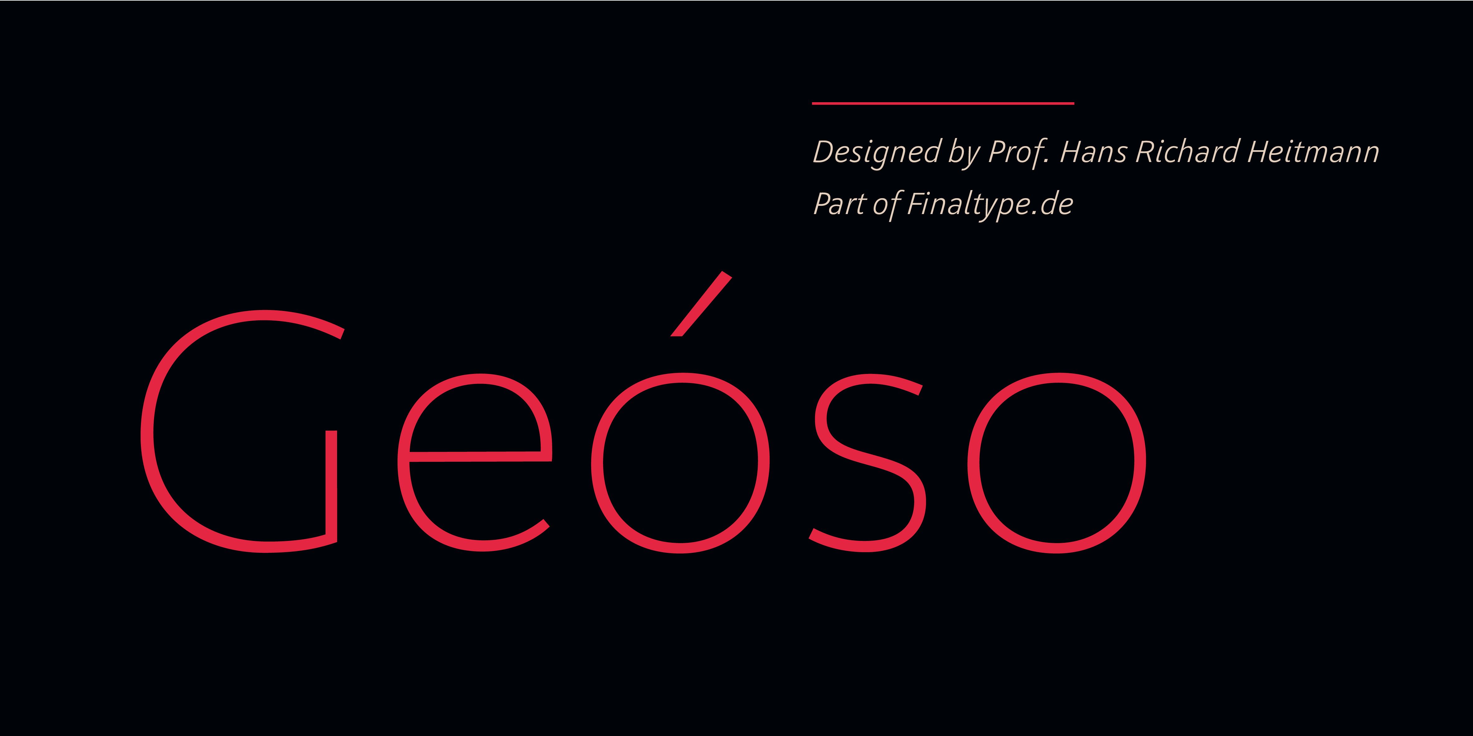
Geóso
Buy Geóso via FontspringItalics
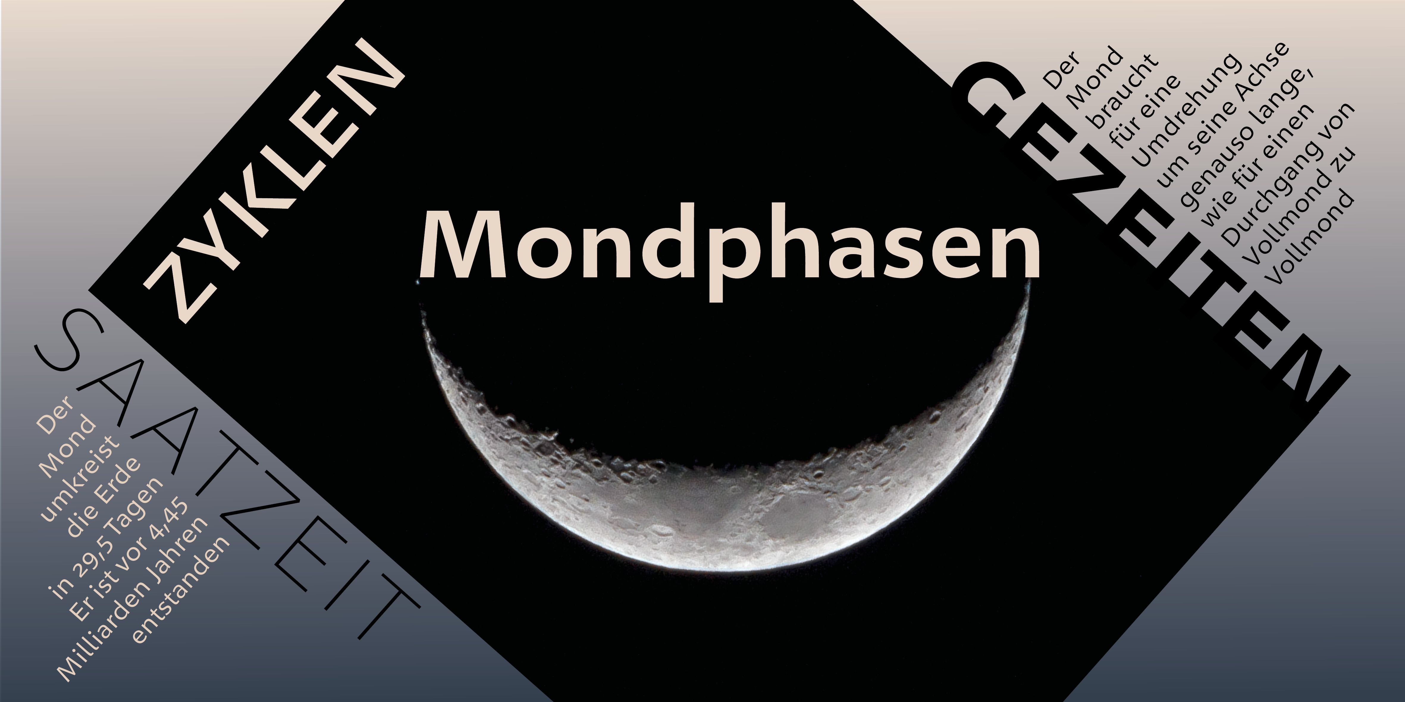
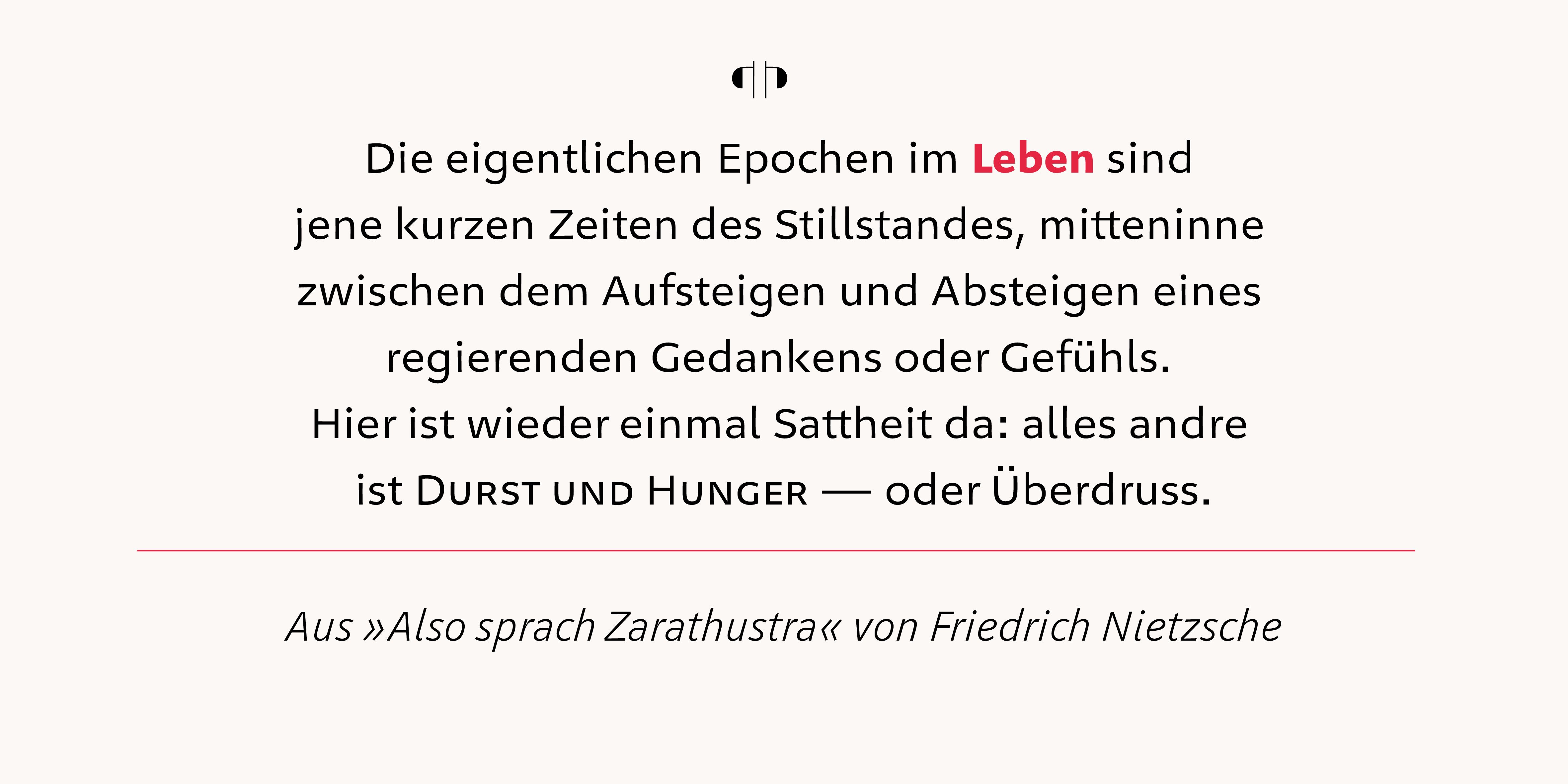
Italics can be clearly recognized in regular text and serve as a subtle, yet distinct method of accentuation. The two-story a is preserved, but can be manually exchanged with a single-story one.
Uniwidth System
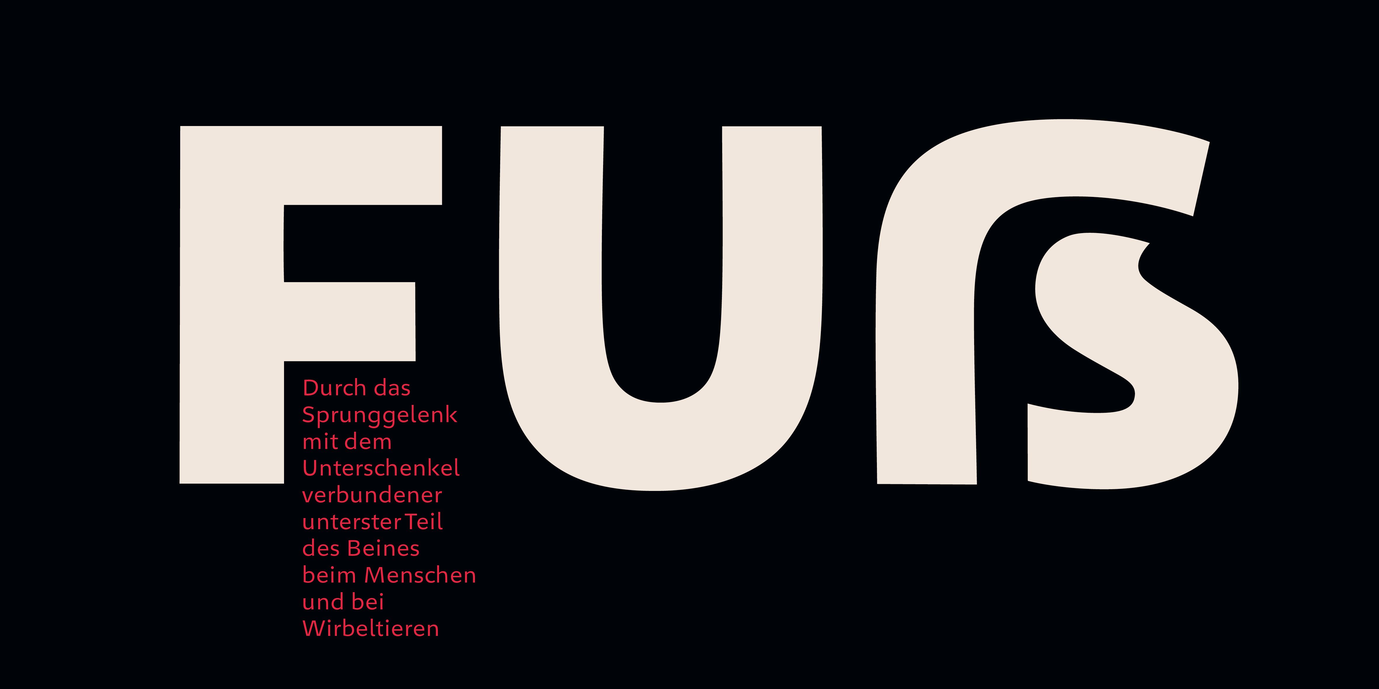
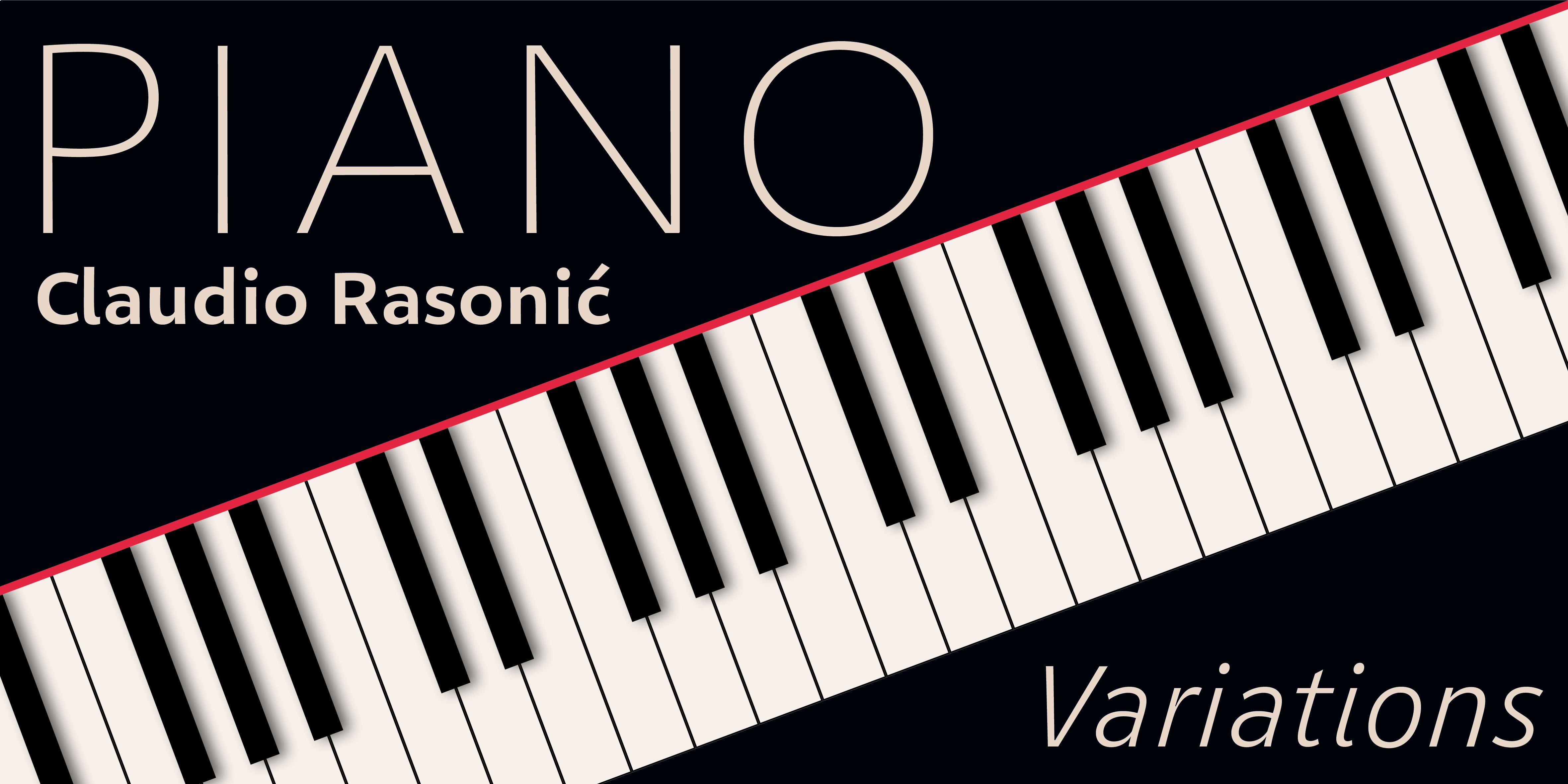
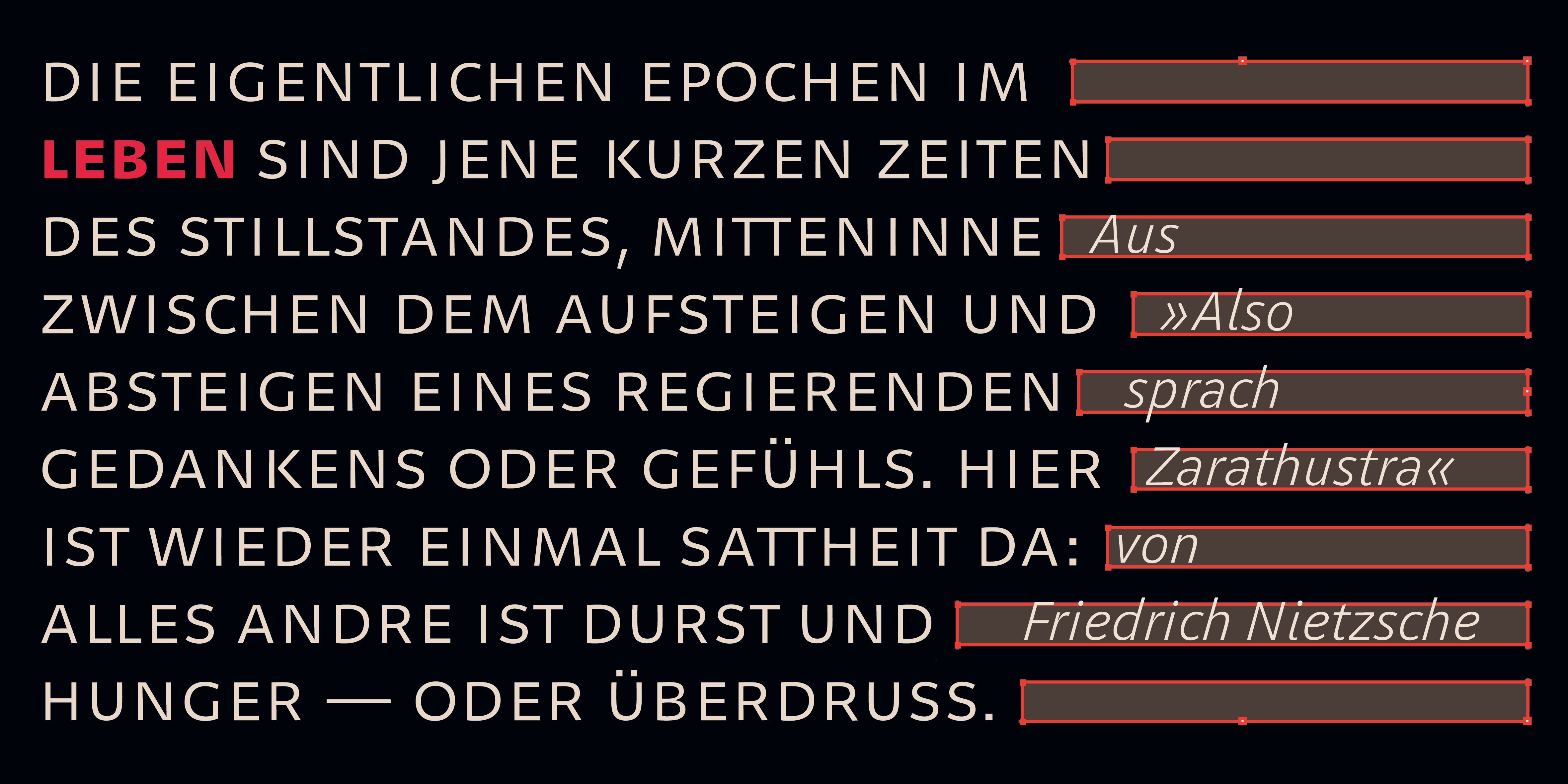
A distinguishing feature of Geóso is its uniwidth system. A line set in thin is exactly as long as in extra bold
This uniformity in character width is especially helpful when space is limited and precision is required. Geóso retains all line breaks even when mixing & matching weights: the layout won’t change even with last minute reconsiderations regarding font weight choice. Digital applications, such as hover effects and animations, are a natural match for Geóso.
uniwidth/uniwidth/uniwidth
uniwidth/uniwidth/uniwidth
uniwidth/uniwidth/uniwidth
uniwidth/uniwidth/uniwidth
uniwidth/uniwidth/uniwidth
Sophisticated number system
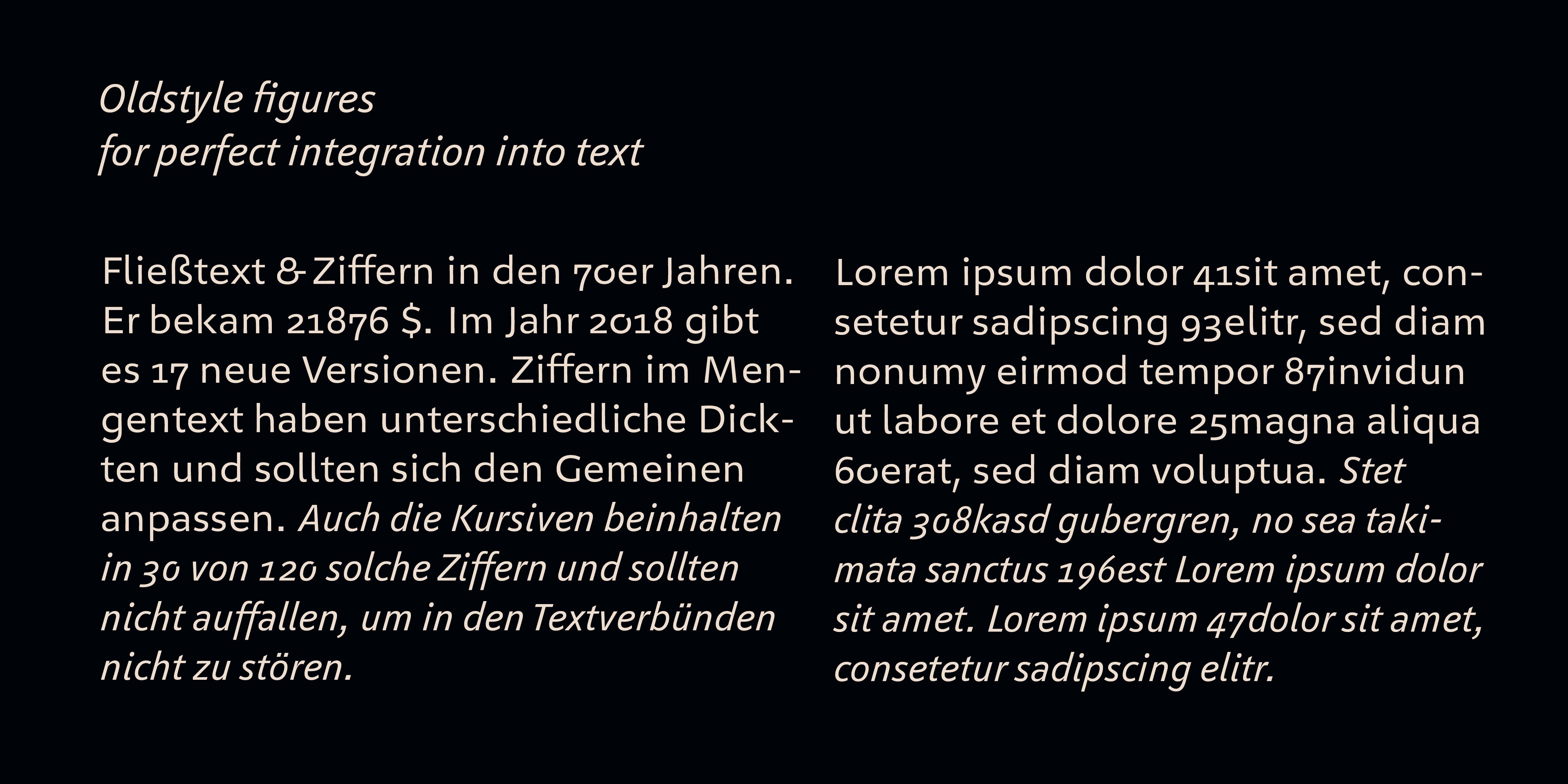
Numbers and mathematic symbols all stay in place thanks to aligned widths. Numerous alternatives for each number make them look good in any context. All mathematic symbols and punctuation marks are based on the same grid.
Space, period, comma, colon etc. are all based on the numbers’ width. Numbers, mathematic symbols and punctuation marks can be accurately positioned one below the other. In fractions, letters may be used both in numerator and denominator. All combinations are possible and will be displayed accordingly via OpenType features.
Quality of shape
Finaltype typefaces distinguish themselves through their exceptional quality of shape. This quality is most apparent in the transitions between straight lines and curves as well as in the shape of the counters. Optical adjustments are a given for all Finaltype typefaces — not just geometrical ones, like Geóso. There is a difference between a geometrically and an optically straight line! We reject strictly constructivist approaches and unrefined modular designs. The humanist influence is a major factor in the design philosophy behind Geóso.
Uppercase text
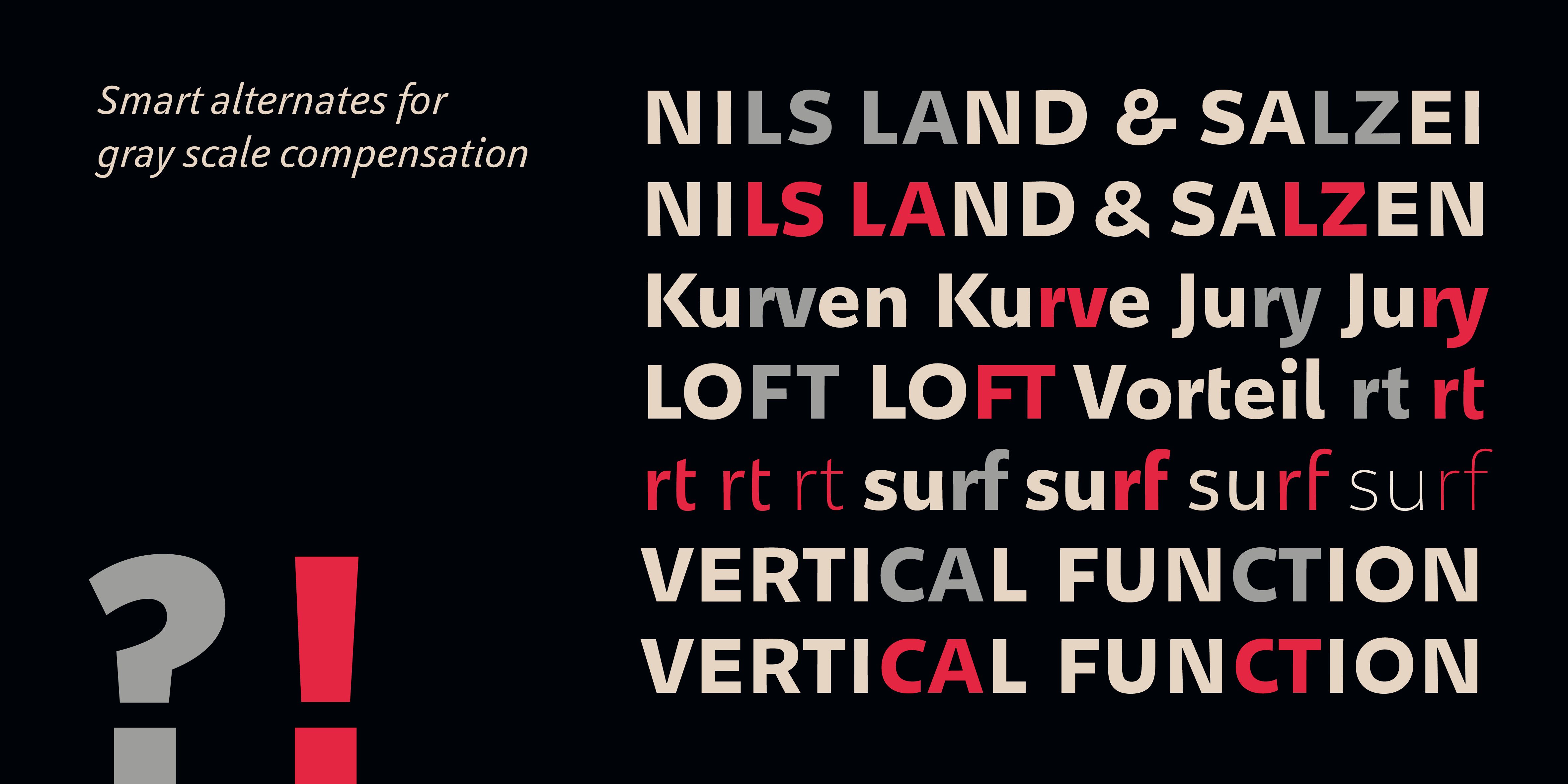
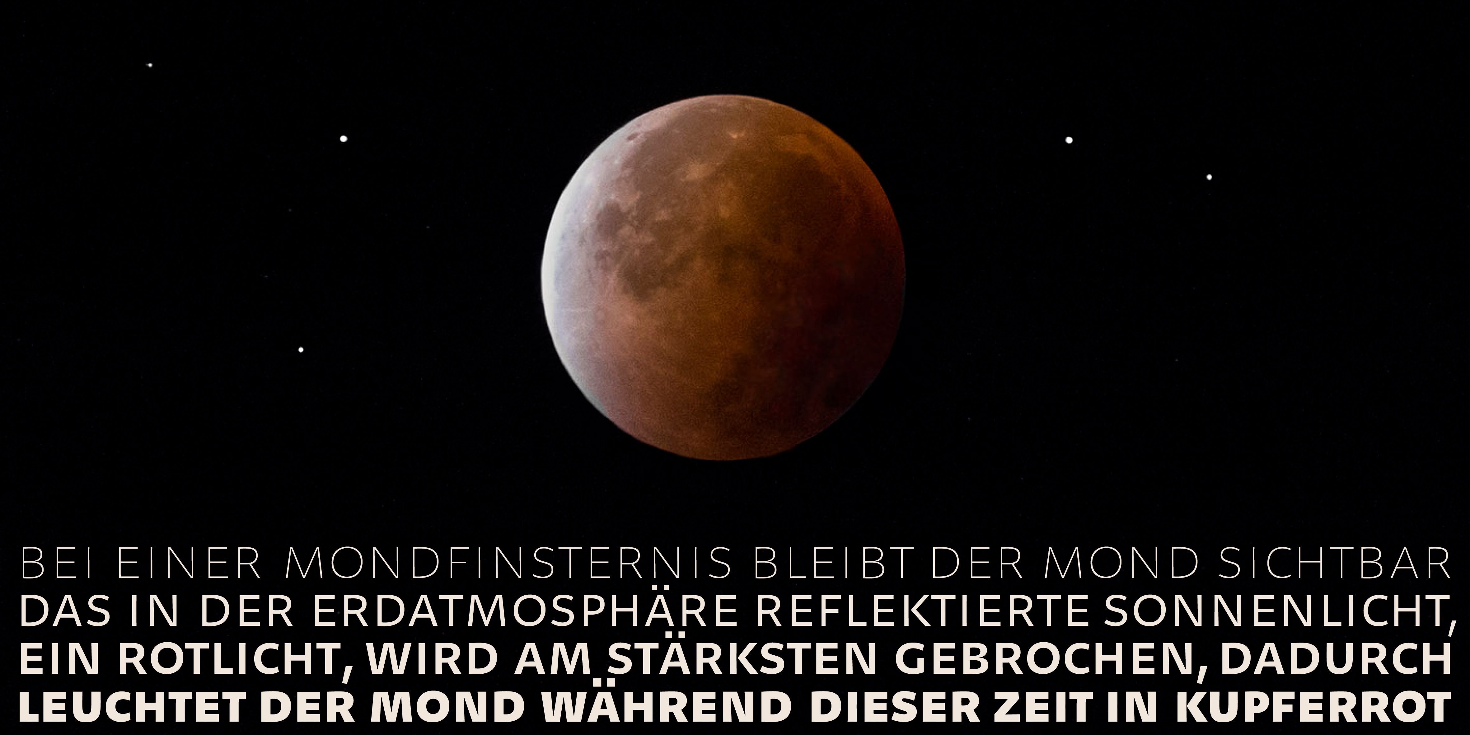
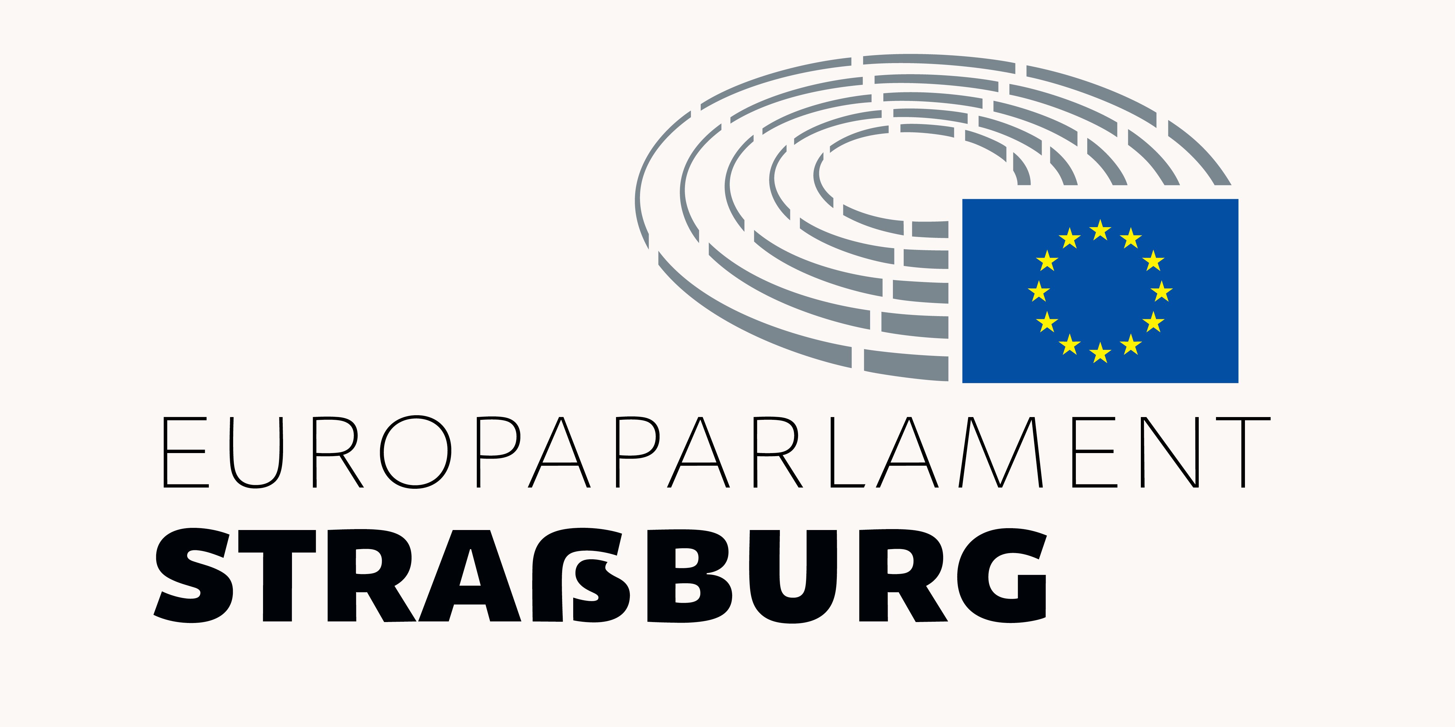
Thanks to its precise letterspacing, Geóso looks smooth and balanced when set in uppercase. Automatic ligatures optimize type color. Naturally included: the uppercase ß (also in small caps). Cap height guillemets are automatically applied in uppercase text.
Features
Common features are applied automatically. The four different number sets need to be selected manually. Tabular numbers and mathematical signs can be vertically aligned via space. This also applies to small cap numbers. Fractions are composed via OpenType feature and are all based on the same grid.
Diacritics for more than 37 languages
Geóso fully supports Afrikaans, Albanian, Basque, Bosnian, Catalan, Croatian, Czech, Danish, Dutch, English, Estonian, Faroese, Filipino, Finnish, French, Galician, German, Hungarian, Icelandic, Indonesian, Irish, Italian, Latvian, Lithuanian, Malay, Norwegian Bokmål, Polish, Portuguese, Romanian, Slovak, Slovenian, Spanish, Swahili, Swedish, Turkish, Welsh and Zulu.
